
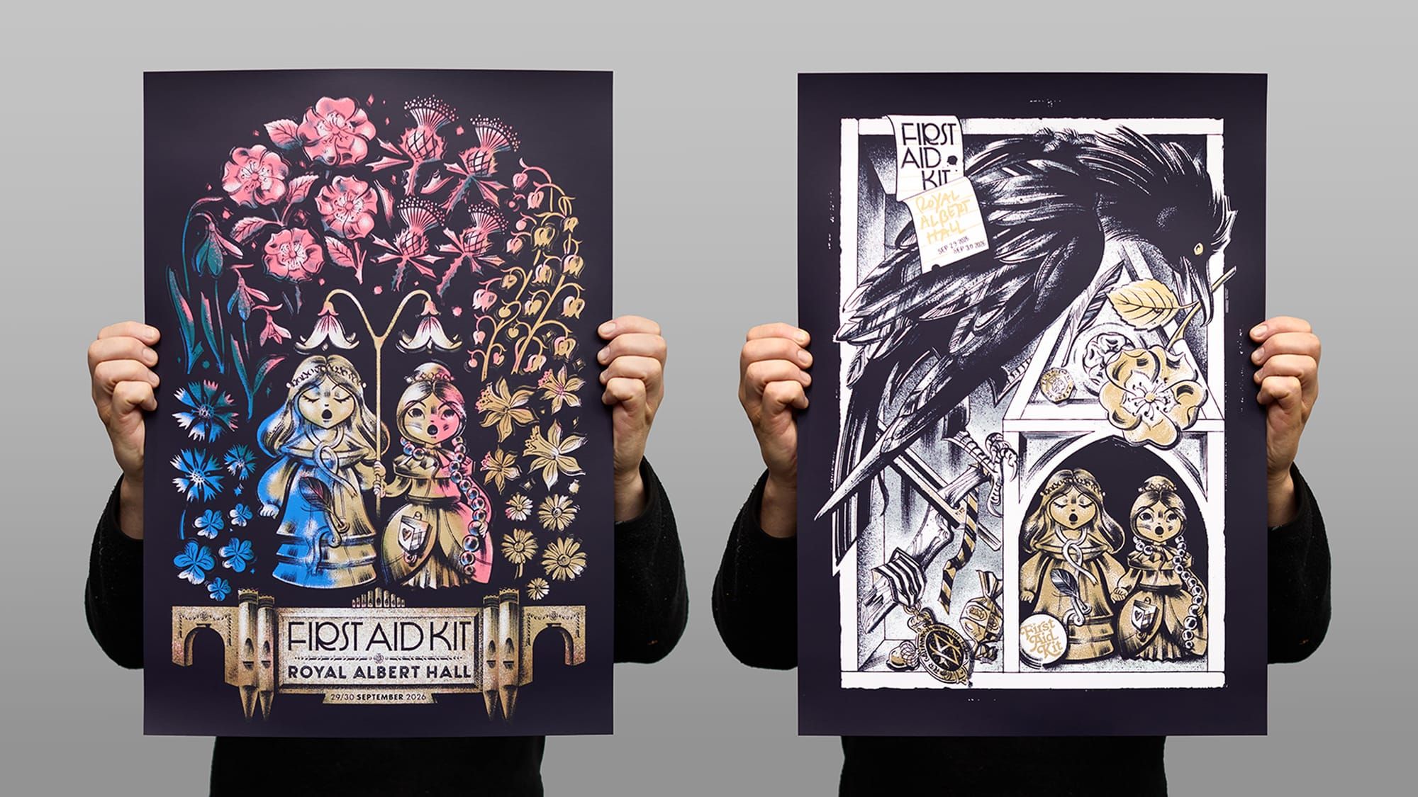
First Aid Kit play Royal Albert Hall, with posters by Anne Benjamin.
For their only UK shows of 2026, First Aid Kit filled two autumn evenings at Royal Albert Hall with their beautiful music. Here's a look at the posters for those concerts, created by Anne Benjamin and silkscreened at the White Duck Editions studio.
First Aid Kit, the Swedish folk harmony of sisters Johanna and Klara Söderberg, were recently performing their only 2026 shows in the UK, playing back-to-back concerts at the inimitable Royal Albert Hall. Originally slated as a one-off performance of their Stay Gold album, played in its entirety with the backing of the Gothenburg Symphony Orchestra, the one concert quickly turned into two, due to such high demand for tickets.
As well as seeking tickets, First Aid Kit fans are of the ilk where a silkscreen printed poster is highly sought after, and so the band turned to their artist collaborator of some 10+ years, Anne Benjamin, to create not one, but two posters for the concerts. With artwork taking shape, we then heard from the band's management, and the conversation about bringing these posters to life got underway.
Suffice it to say, all good print relies upon the hallowed client-artist-printer relationship. We're thankful to have been printing for First Aid Kit since 2018, working with the band's management and Anne Benjamin on every edition, and so the clarity of communication and intent to create our best work is a naturally shared set of ideals.
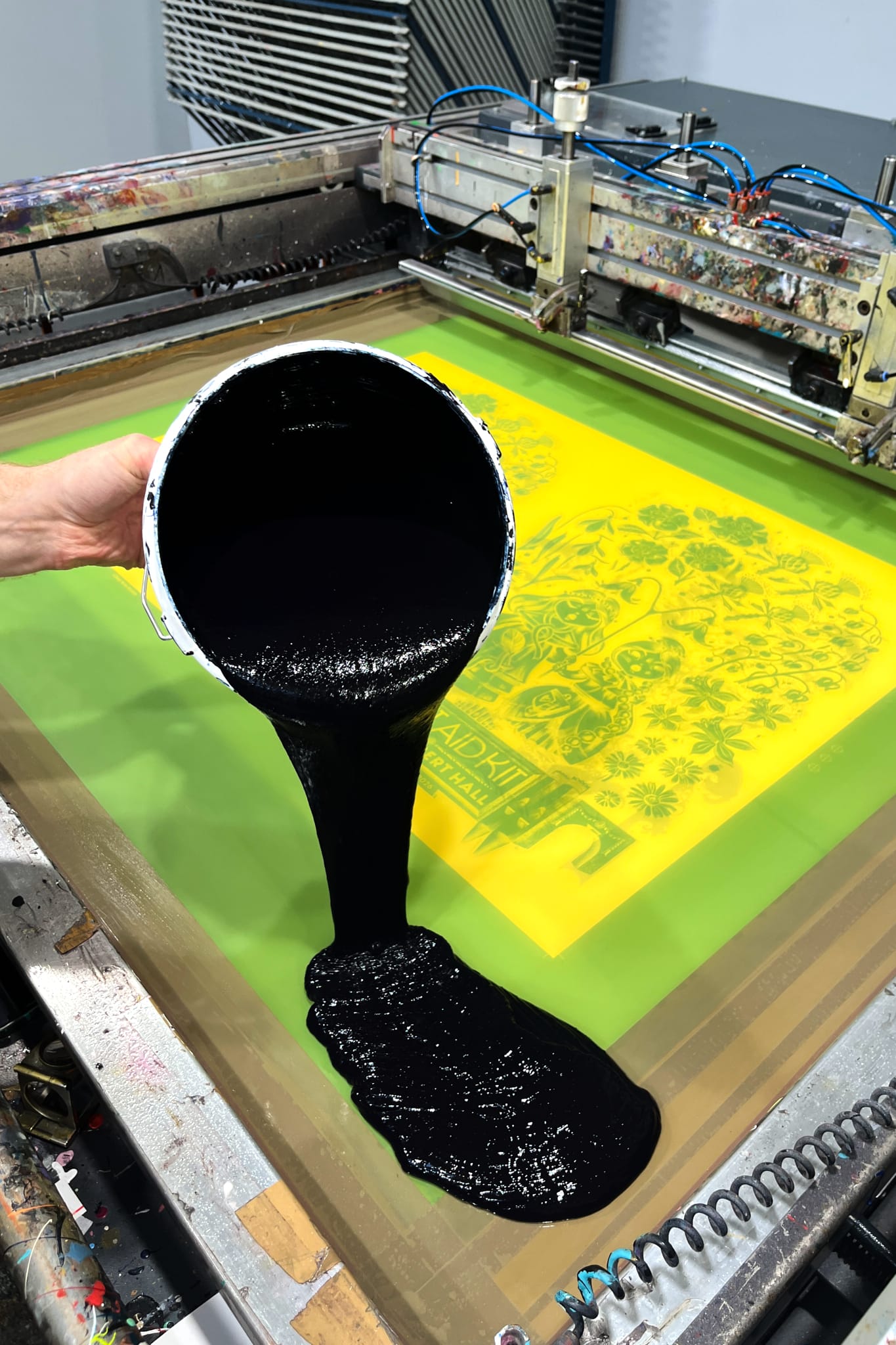
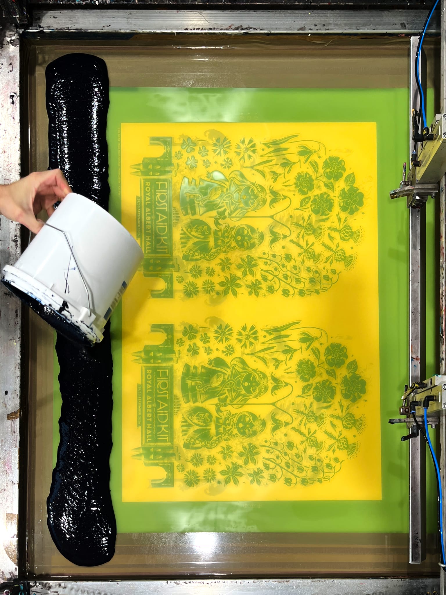
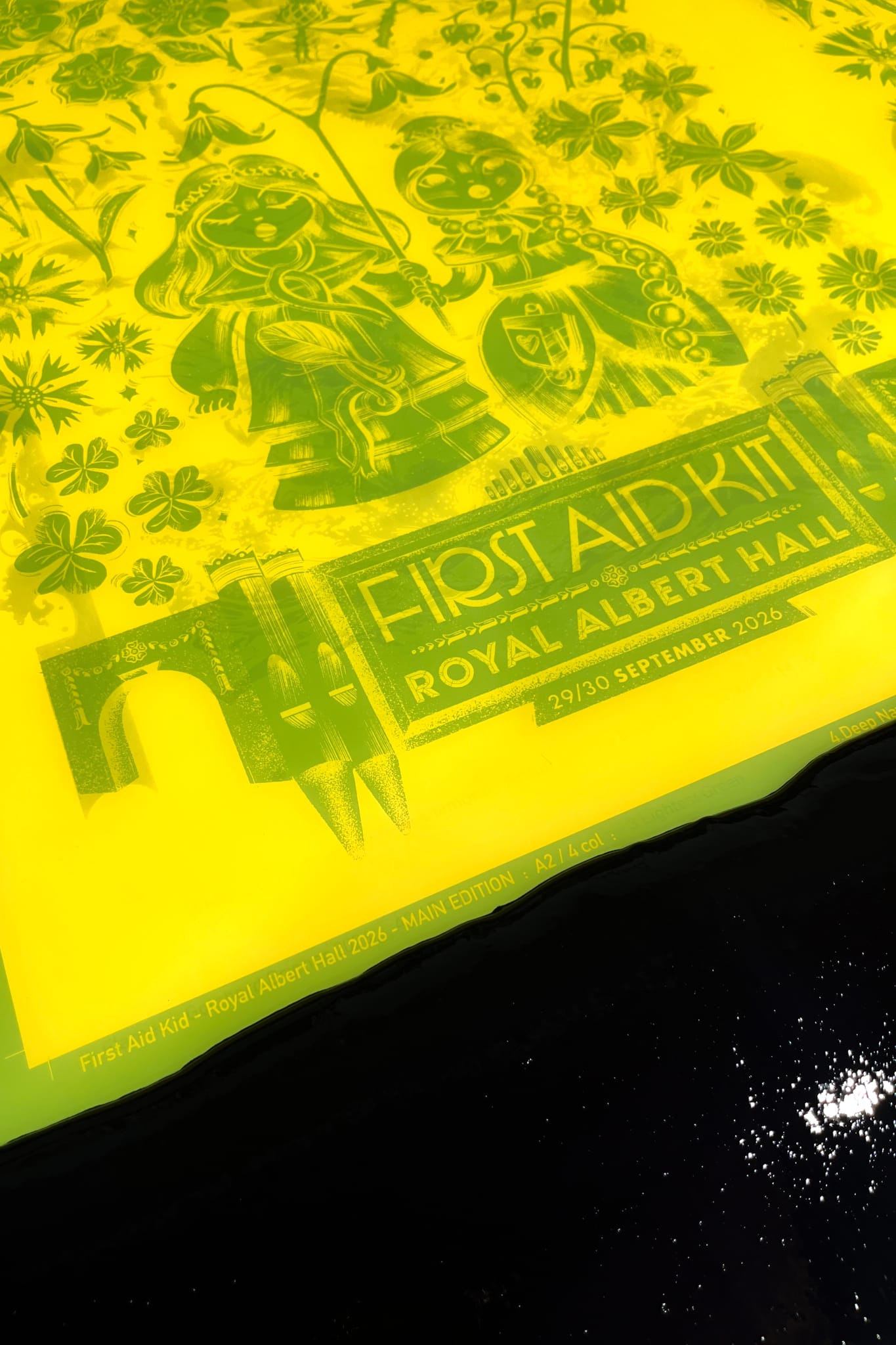
Some weeks after opening talks, we laid eyes on Anne's artworks, and found them to be a resonant exercise in both her brushed style and subtle storytelling. Intrigued by the imagery in both posters — the floral elements, the architectural forms, the sisters as figurines — we took a moment to converse with the artist, asking after the thought process that went into the making.
With more than a decade of collaboration to reflect upon, Anne explained how they have always used imagery of the two sisters in the band's posters, and how for these special shows it was the amalgamation of this and two other key points of focus that inspired the work: that they would be performing the Stay Gold album in its entirety with the Gothenburg Symphony Orchestra, and the historical Royal Albert Hall itself.
‘The design of the figurines was inspired by vintage miniature German wooden dolls holding flowers, [and] I wanted to use an array of flowers to represent the orchestra members with the girls in the centre, while also bringing in architectural elements of RAH and its famous pipe organ,’ Anne explained, before expanding on the extensive use of flora in her work.
‘The sisters hold a Linnaea Borealis — a Twinflower — which is native to Sweden. For the orchestra I incorporated flowers of the United Kingdom, like roses, thistle, shamrock, lilies of the valley, daffodils and snowdrops.'
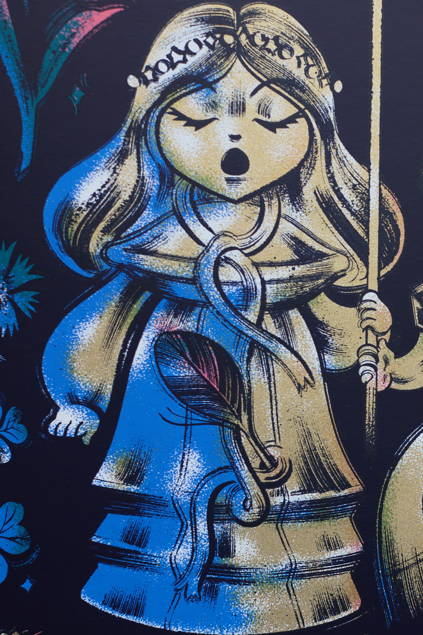
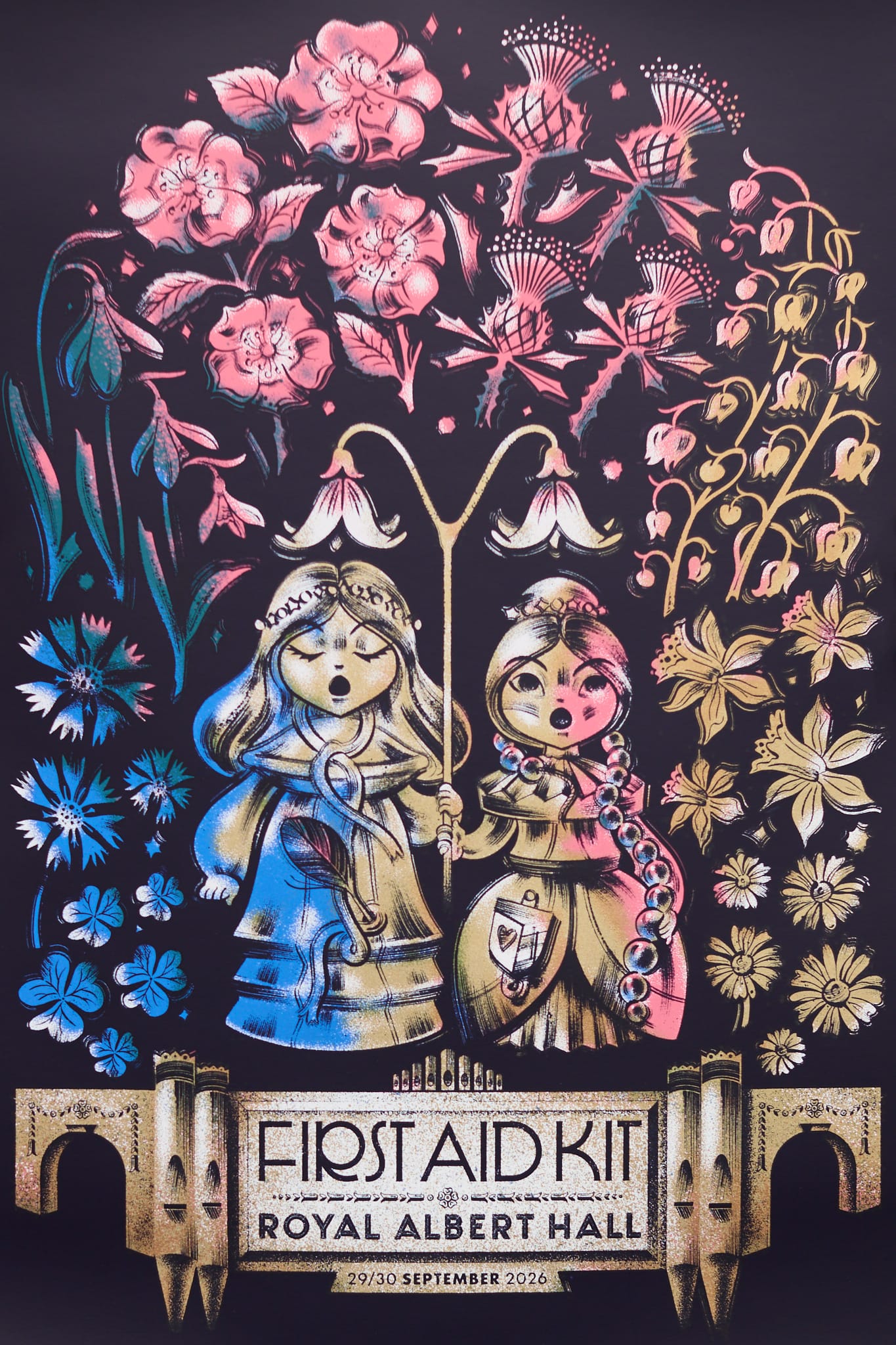
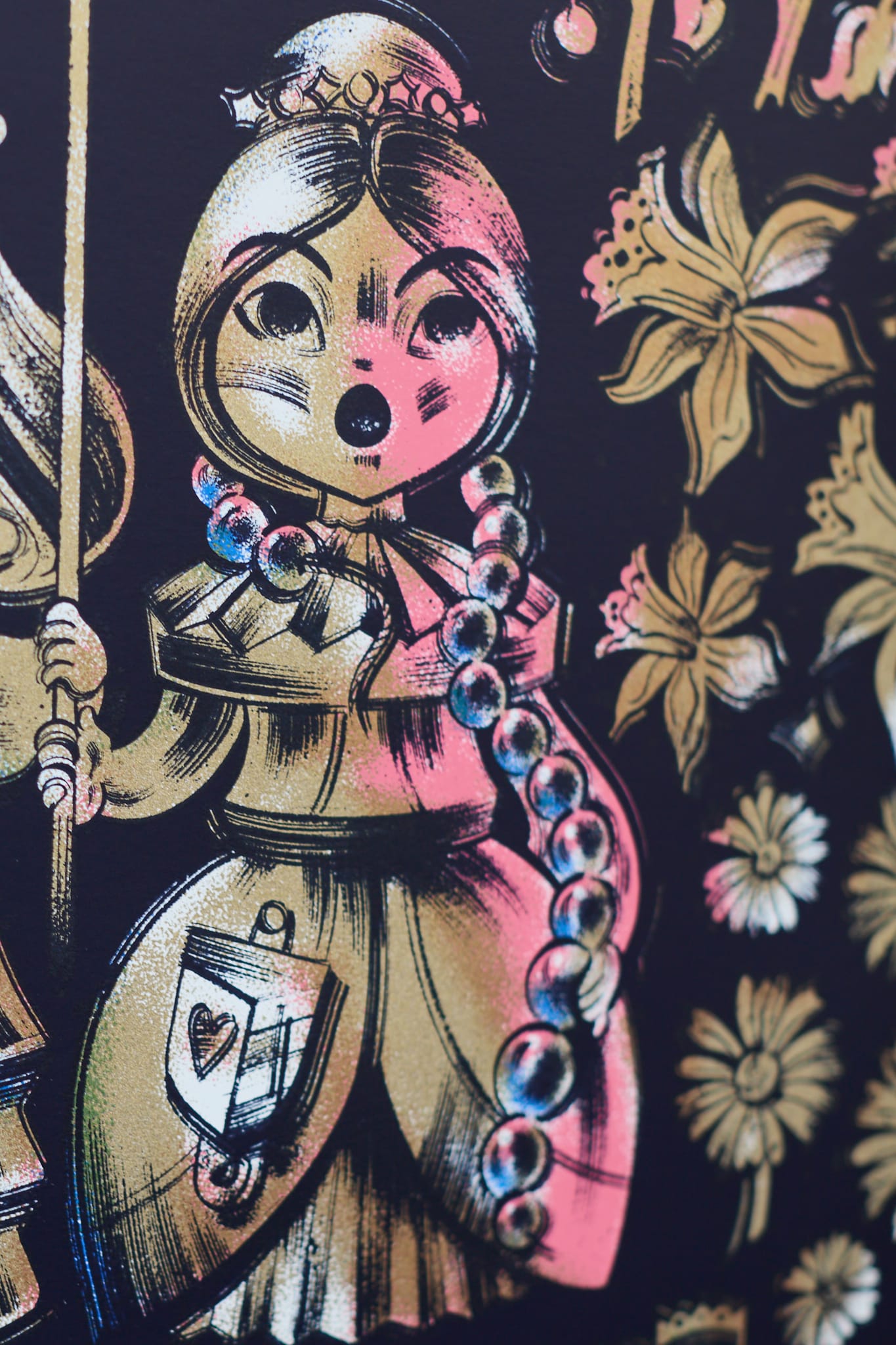
Once made explicit, it is impossible to see the poster as anything other than what it is: a delightfully clever and thoughtful portrayal of all who coalesced to create pure concert magic.
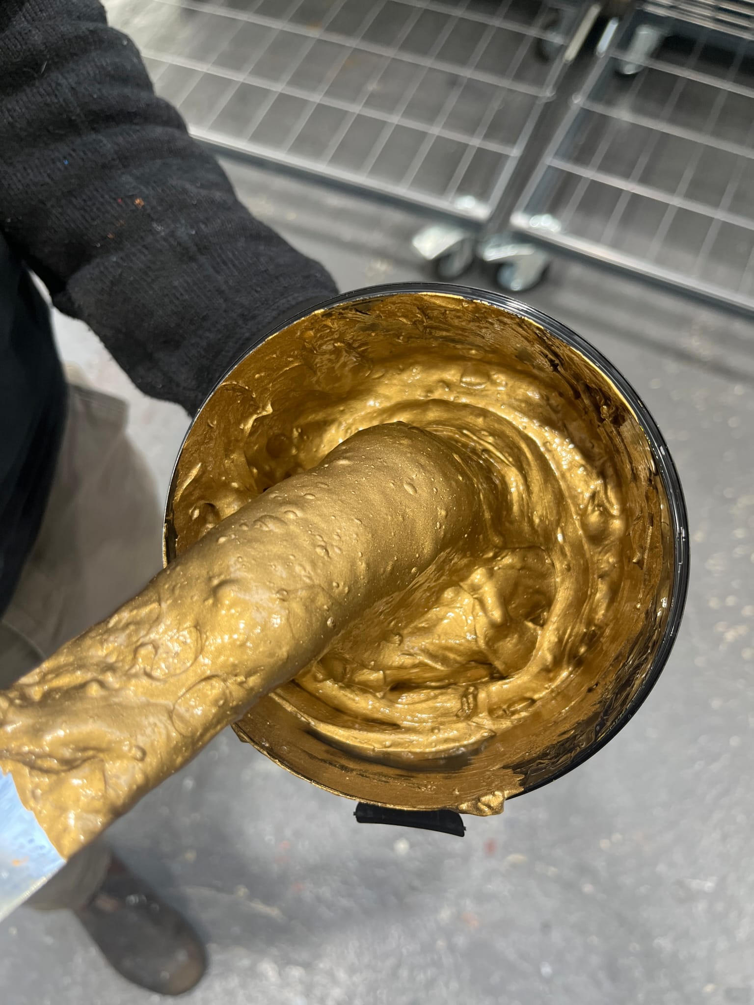
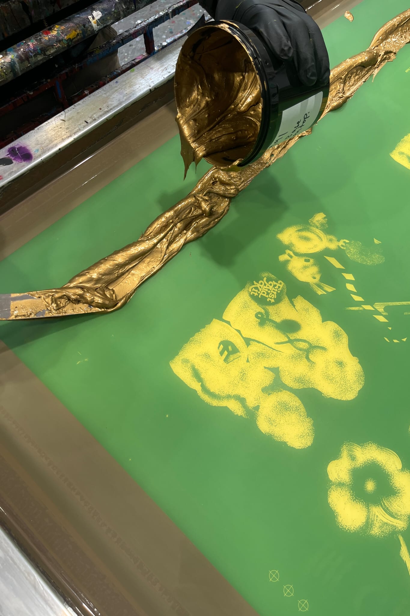
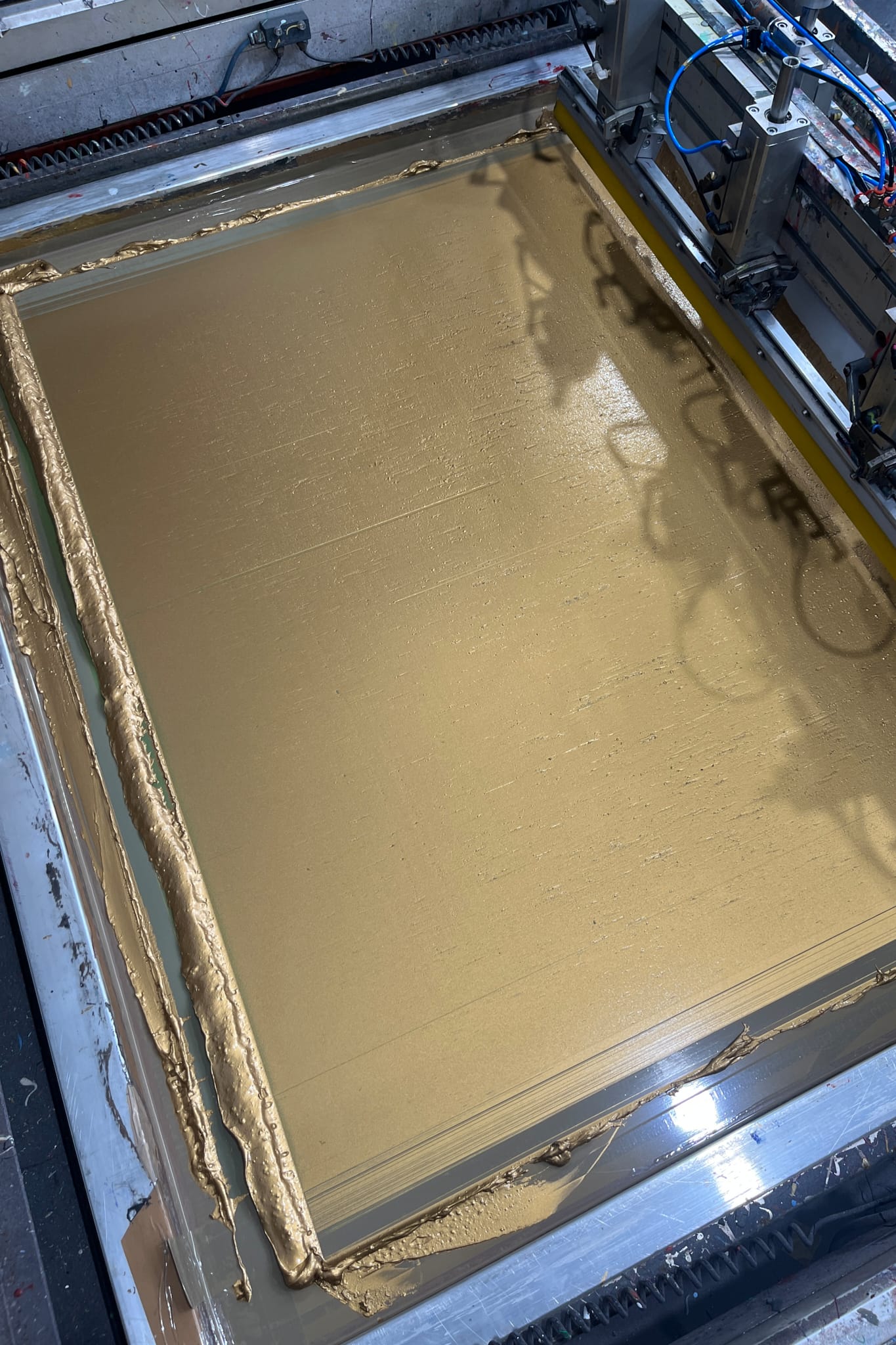
Of the poster’s more practical aspects, Anne said, ‘The dramatic gel lighting was inspired by the colourful dancing flowers in Disney’s 'Fantasia'. White Duck had previously printed another poster of mine with the most luscious metallic gold ink, and I definitely wanted to use that here as well.’
As you will have gathered, it’s been our pleasure to work with Anne on a string of First Aid Kit posters, stretching back as far as 2018, when the Söderberg sisters brought their Rebel Hearts Tour to the UK, Ireland, and then into the rest of Europe.
Although it was a metallic silver we used for one of those First Aid Kit posters in 2018, we have, as Anne says, used a truly luxurious gold on at least one other Anne Benjamin poster. The metallics we use in the White Duck Editions studio are by Lascaux, from their Studio Bronze range, and are all made with genuine, non-oxidising metal alloys. When the inks are fully dried, the finish is a resplendence of sparkling lustre that catches the light and throws it back, imbued with a deep, tangible warmth.
Metallic gold aside, some of the challenge of working with Anne’s artwork is found in her use of translucent overlays. More specifically, those compound values that are arrived at by the overlapping of one colour by another. This is one of those vital nuances that sets silkscreen print apart — the flexibility in ink formulation and print method that allows such characterful interaction of colour — but how the artist’s intention on the computer screen translates to print is not always a straight line.
Silkscreen print is not, after all, an exact science — it is as much an art — and the 20+ years of studio experience that White Duck Editions brings to the table means that every print produced is an exercise in both.
For Anne’s main edition, where blue and pink interact with the intention of creating a distinctly earthy green, we decided to introduce a new, unique layer to the print. This layer was highly translucent, designed to gently steer rather than forcefully colour, offering a helping hand to that key point of interaction where the compound wasn't quite hitting the right shade of green.
To offer further insight, there is a dark pinky blue that you scarcely see, running entirely underneath the deep navy keyline. It is created by overlapping the pink and bright blue already found in the artwork, and it gives the final silkscreen an extra two layers of body and weight, as well as a base for the deep navy to sit upon. Perhaps not immediately appreciated, but this is gorgeous layering upon layering.
As previously mentioned, there was also a second poster, this one for the VIP ticket holders. Using the same deep navy and lustrous gold as the main edition, the VIP poster also expands nicely on the narrative set out in the main edition.
‘For the VIP poster, we needed a unique design that still carried the theme,’ Anne explained. ‘I had recently learned about the ravens that inhabit the Tower of London, and I thought it would be interesting to have a raven collecting trinkets for its shrine.’
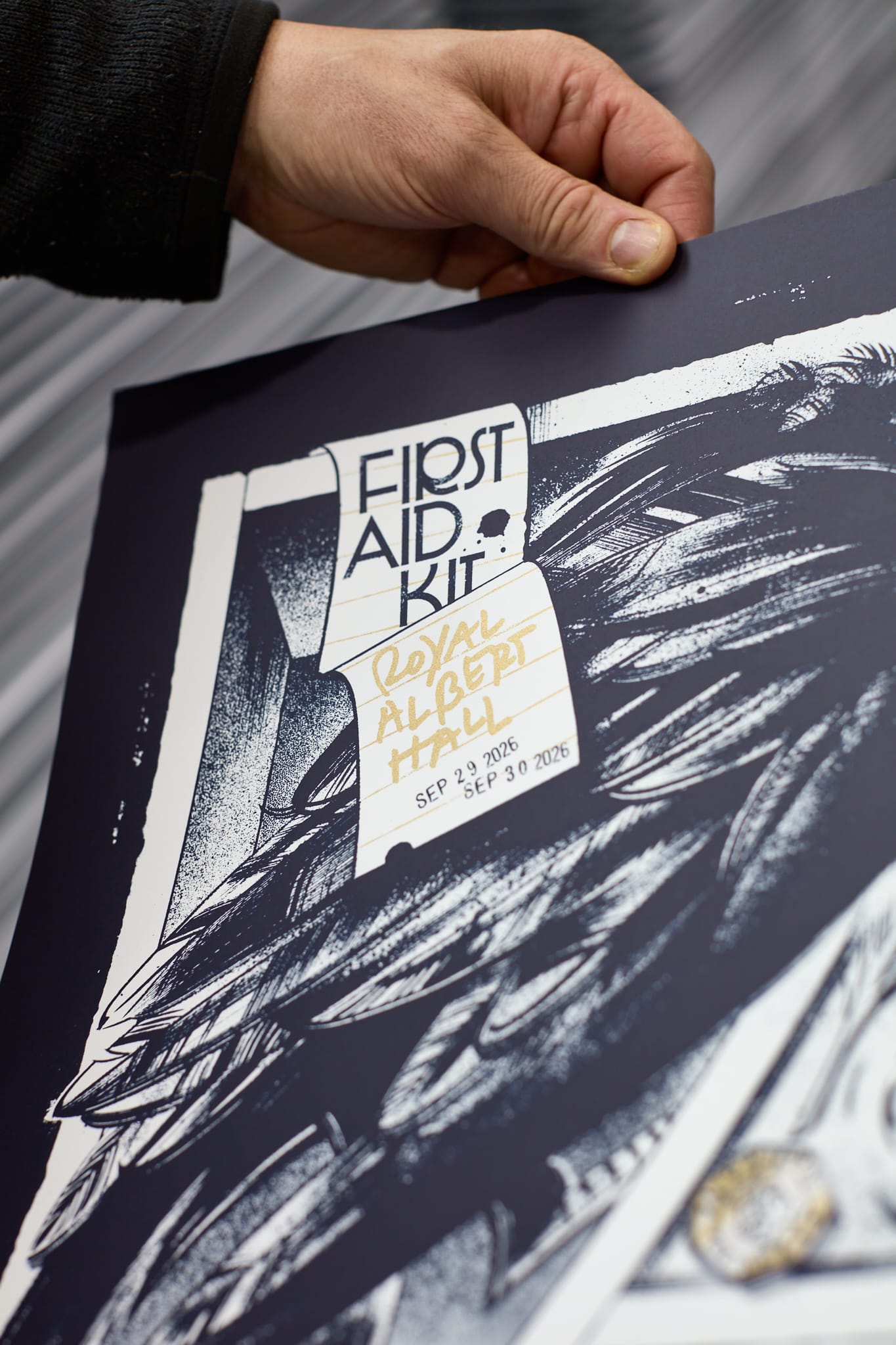
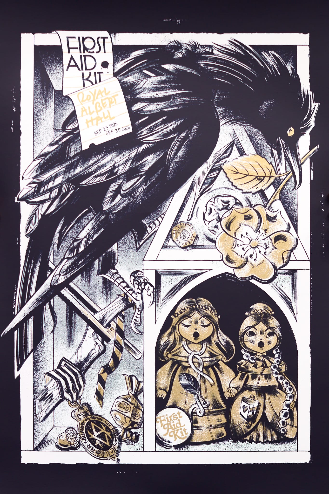
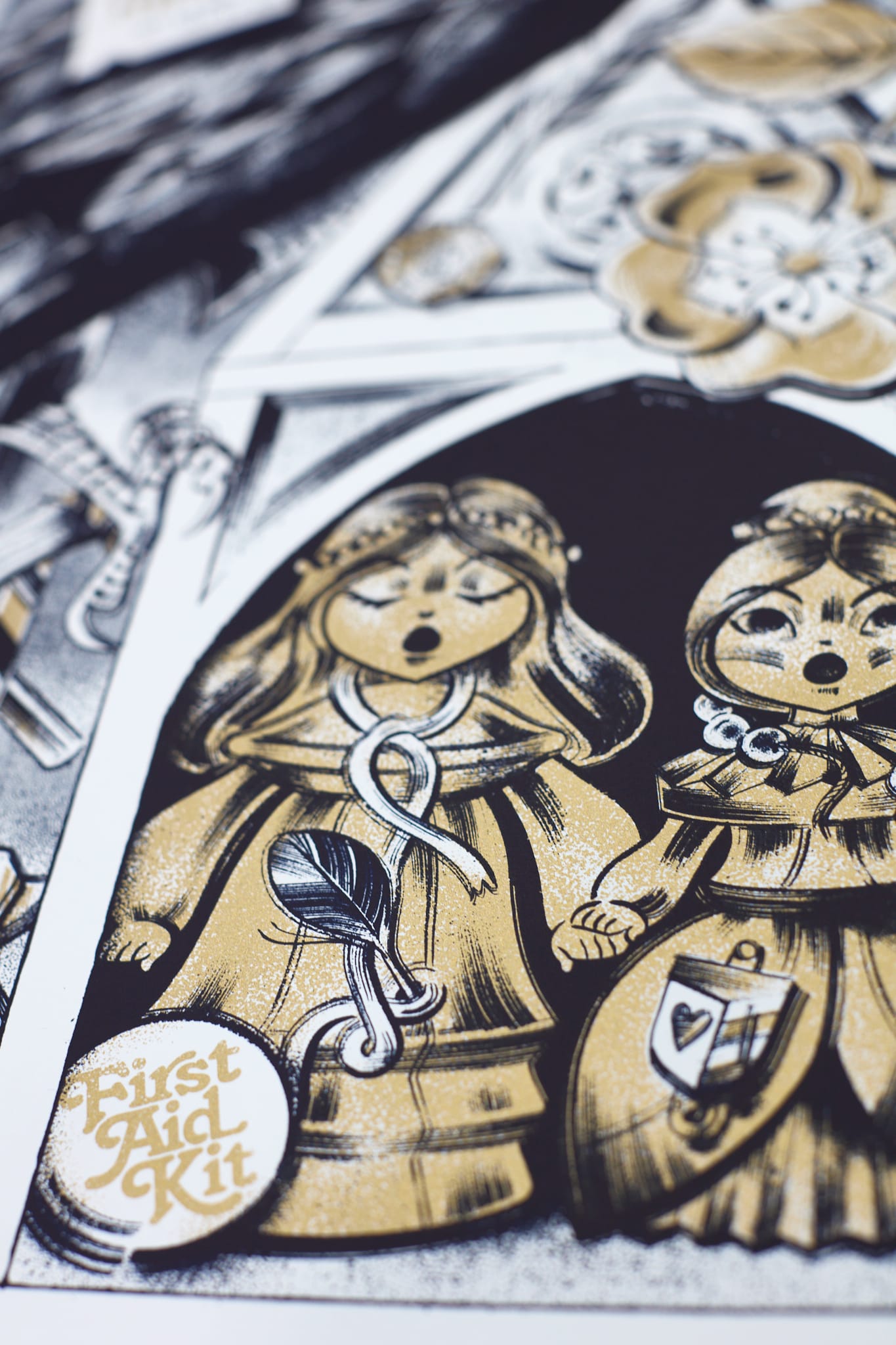
It was also fascinating to discover that the little stone structure in the VIP poster was inspired by the Albert Memorial that sits proudly in Kensington Gardens, facing the Royal Albert Hall. A considerate detail that ties the two landmarks intrinsically together, as indeed they are inseparable in real life.
To get the VIP poster to work as a companion piece for the main edition, it also required an additional colour, one that is completely hidden by the deep navy. By virtue of its composition, the deep navy ink is somewhat translucent, and therefore its colour changes depending on what it overlaps, be it plain white paper or another ink. As the deep navy in the main edition was printed over a compound of the pink and bright blue, we had to create a unique ink that matched that compound before positioning it beneath the deep navy in the print order. This was a colour critical to the outcome but wholly unseen — hidden away, an unsung hero, silently ensuring that the two editions were beautifully harmonised.
These are just some of the considerations one makes when bringing a silkscreen print faithfully to life. For these First Aid Kit editions, on the one hand, it was to ensure that every brushstroke and intended colour value in Anne’s artworks were rendered with clarity and detail, and on the other hand, it was a balancing act of process and interpretation, bringing to bear both the science and the art.
I’m sure you’ll agree, the outcomes are rich, tangible, and demonstrably layered silkscreen prints, unmistakable as anything else. Just as the hand of Anne Benjamin is unmistakable, and what this client-artist-printer relationship brings to the ever-evolving collaboration with First Aid Kit.
We’d like to send a big THANK YOU to First Aid Kit for once again trusting us with these new print editions, and to Anne Benjamin for always being so brilliant to work with.
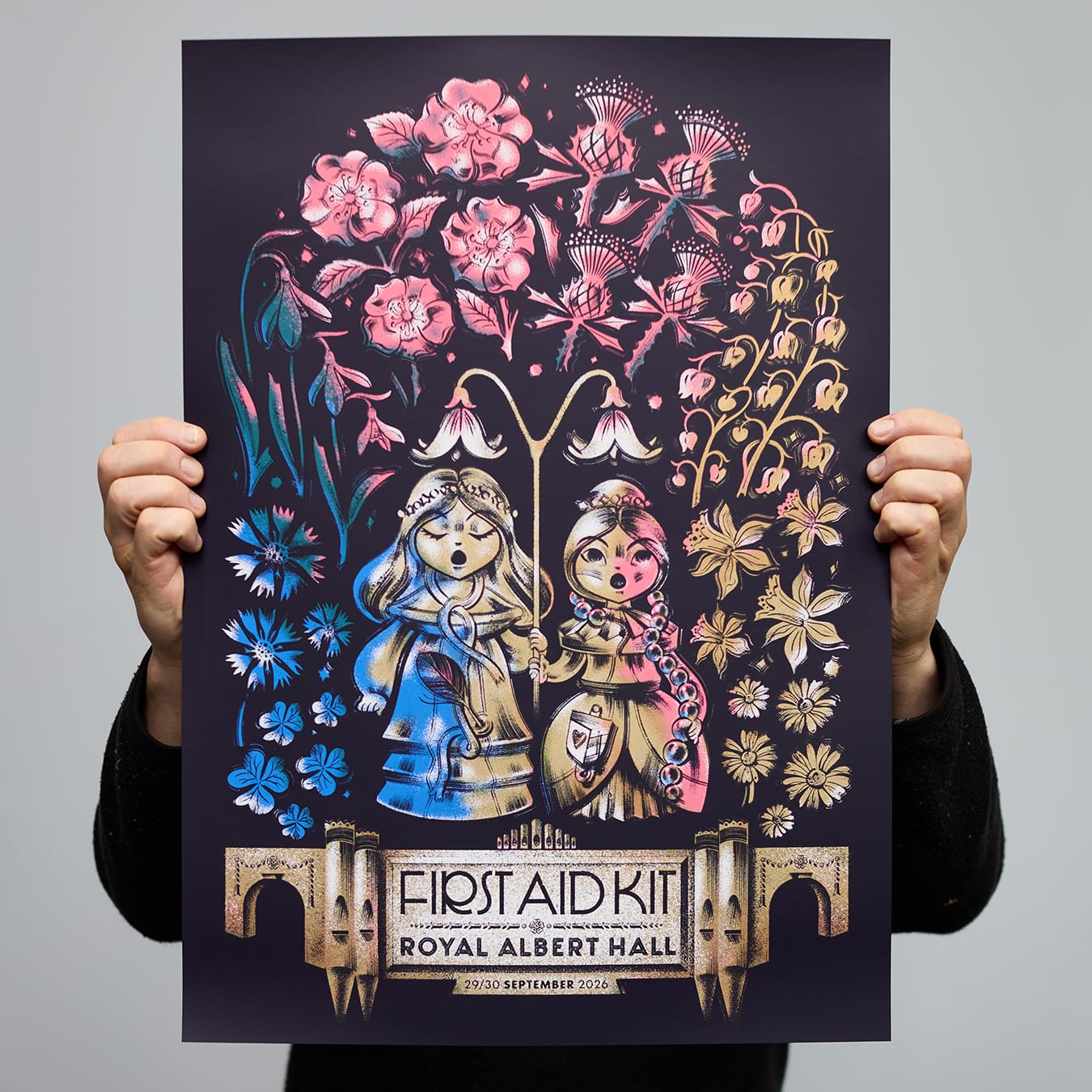
Main edition of 500 + APs
5 col silkscreen print inc. metallic gold
300gsm uncoated paper
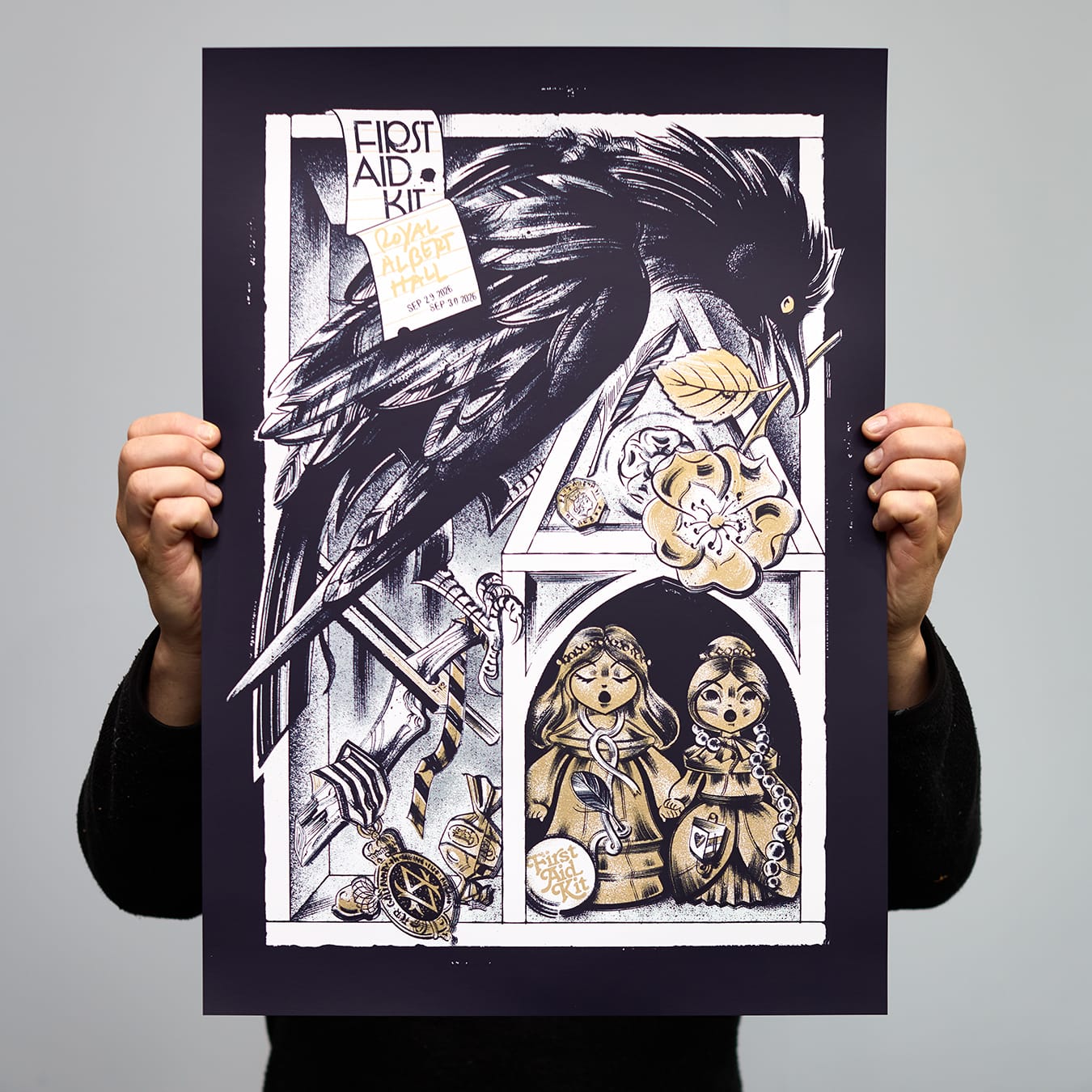
VIP edition of 450 + APs
3 col silkscreen print inc. metallic gold
300gsm uncoated paper


