
Metropolis screen print poster by Ethan Sharp.
Following on from his masterful Perfect Blue, Ethan Sharp has created a highly charged poster for Rintaro’s Metropolis.
Metropolis is a new screen print edition by Ethan Sharp.
We worked with Ethan back in August of 2020, on a newly iterated screen print edition of his fantastic Perfect Blue artwork. An anime fan through and through, with an impressive illustration style that both draws from and gives back to the genre, Ethan’s follow up screen print is an astonishing evocation of Shigeyuki Hayashi’s (the famed anime director, more commonly known as Rintaro) critically acclaimed reimagining of Fritz Lang’s Metropolis.
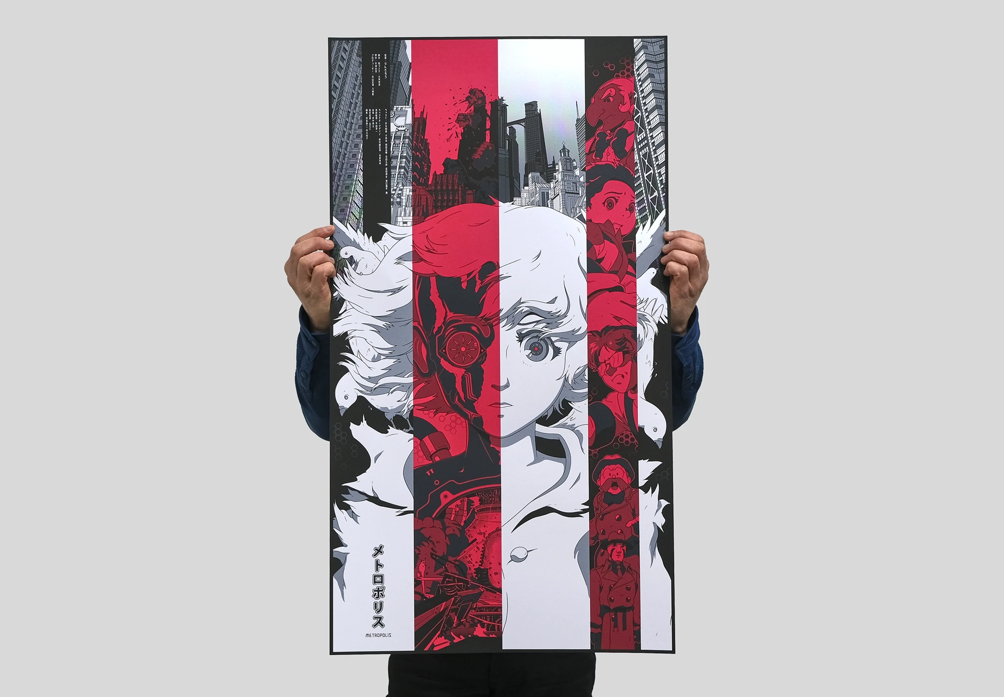
Fascinated by the vertical composition of Ethan’s new work, where bold pillars of red sit alongside contrasting columns of black & white, we asked him about what inspired the illustration and how he came to decide on the sparse, but highly effective, use of colour and space.
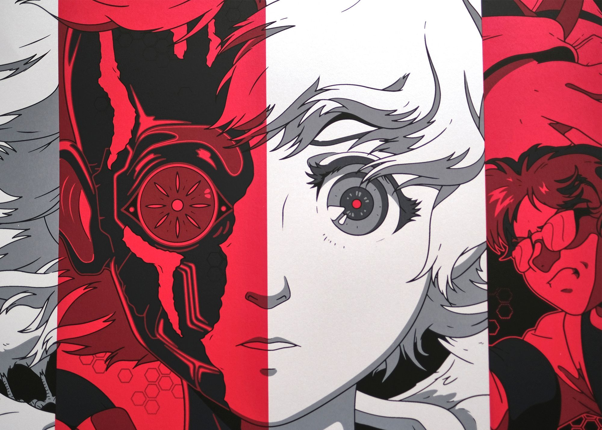
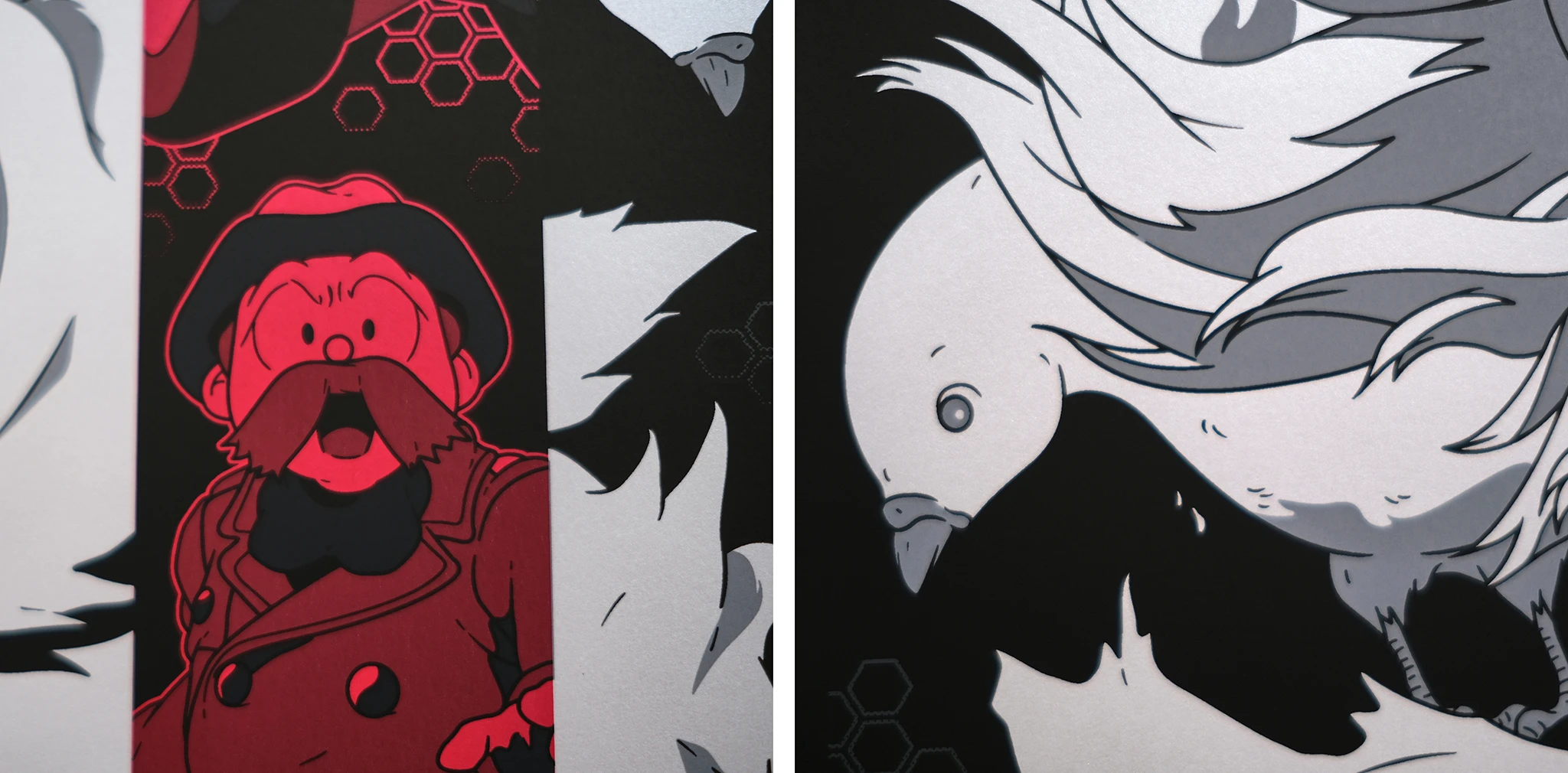
“Like Perfect Blue, these films are a huge inspiration for me and these prints are massive passion projects. The simple black and white colour palette for Metropolis is inspired by, and is a nod to, the 1927 original. The red is to indicate destruction. The poster concept is meant to show Tima’s confusion between thinking she’s human (in the white), then realising she’s a robot built for destruction (the red).”
The key composition in Ethan’s poster centres around Tima (Rintaro’s version of Lang’s Maria), and borrows from a rich history of Metropolis posters that similarly focus on the robotic female lead, parting her down the middle to reveal the machine that resides beneath the synthetic perception of humanity; but where Ethan’s work delivers brilliantly, is in how it conveys the emotional reckoning of Tima’s artificial sentience. The red destruction, depicted as a physical chaos of explosions alongside Tima’s placidly programmed naivety, is an illustrative masterstroke at telling the story of conflict that exists within the system, the individual, and within the human-made robot herself.
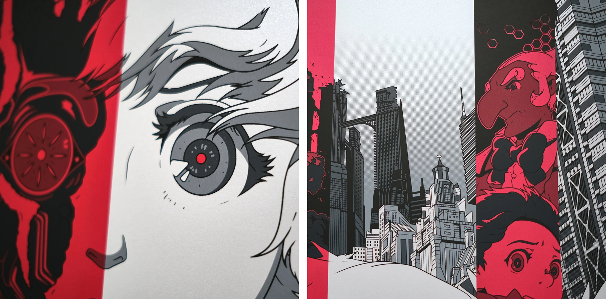
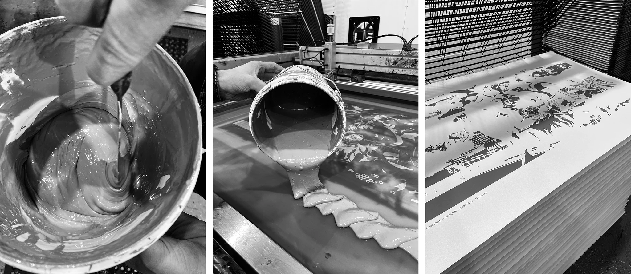
For Metropolis, we worked with Ethan in a very similar way to Perfect Blue, which involved a thorough colour matching process and discussion about papers. The screen print is comprised of five colours, which are two opaque greys, one translucent grey, a highly pigmented translucent red, and black. The red sits midway in the print order, overlapping the first greys to create a series of red tones, with dark grey and black running over the top. A sheer registration takes place down each side of the red columns, which is critical in maintaining the integrity of the illustration.
After discussing a few variant options, and swatching inks onto some alternative papers, Ethan pushed for a fantastic pearlescent paper for the entire edition, which was a great decision, as it lifted the entire print to another level.
When asked what’s next in the pipeline, Ethan was enthusiastic but cagey, saying that work was almost complete on his next poster. Clues were dropped that is may be Satoshi Kon related, but no title was named. The great, and very sadly late, director of Perfect Blue had a number of excellent titles under his belt by 2010, including Tokyo Godfathers (a personal favourite), but I guess we’ll just have to wait to see what Ethan’s been working on.
For now, let's say this: anticipation levels are already set to maximum!
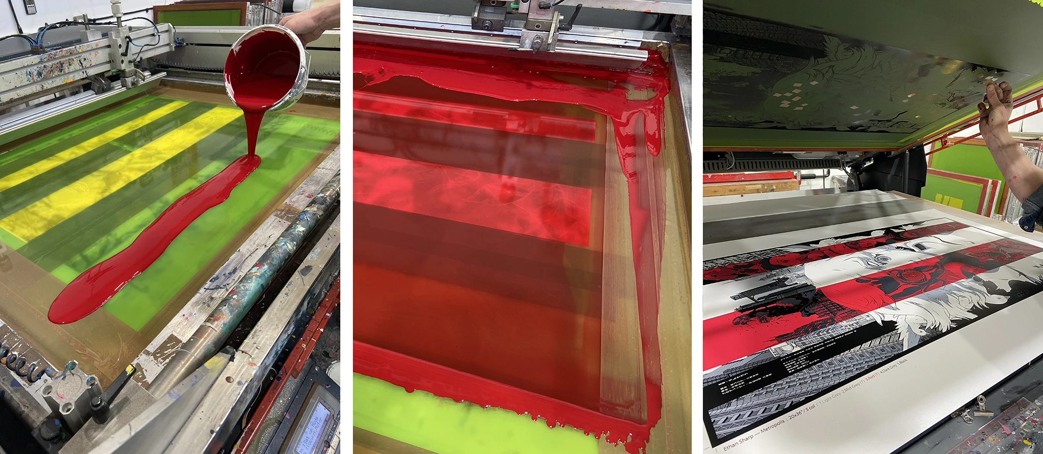
Metropolis was screen printed at White Duck Editions in a 5 col edition of 170 + AP’s, 20”x36” on 290gsm Peregrina Majestic Marble White paper. Head over to Ethans Sharp’s shop, where we believe just a few copies are still available.
