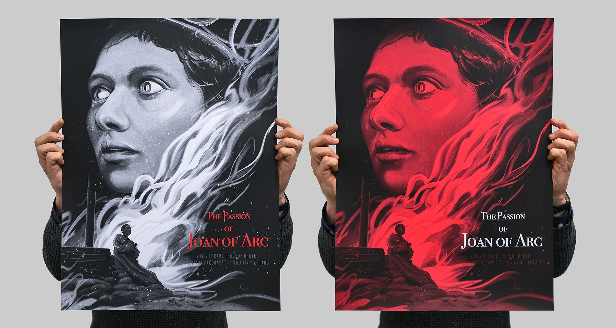
Joan of Arc by Zi Xu.
For Black Dragon Press’ recent release, The Passion of Joan of Arc, American illustrator Zi Xu turned in a painting full of tone and finesse. We offer up an illustrated history of the method that made it a screen print.
The Passion of Joan of Arc is a new screen print edition by Zi Xu, commissioned by Black Dragon Press and released as their 24th collaboration with Mondo in the US. Produced in two distinct editions, the black & white variant was only available in the UK, while the red variant was exclusive to the US.
Zi Xu is a new artist on our radar, but her work speaks loudly at first contact. As a member of the respected Poster Posse, Zi certainly knows her way around the narrative of a poster, and her work is largely recognisable by the bold mark-making and strong brushstrokes. It’s well worth visiting her website, where a portfolio of brilliant sketches sits proudly alongside a portfolio of shipped work. One gets a real sense of the whole.
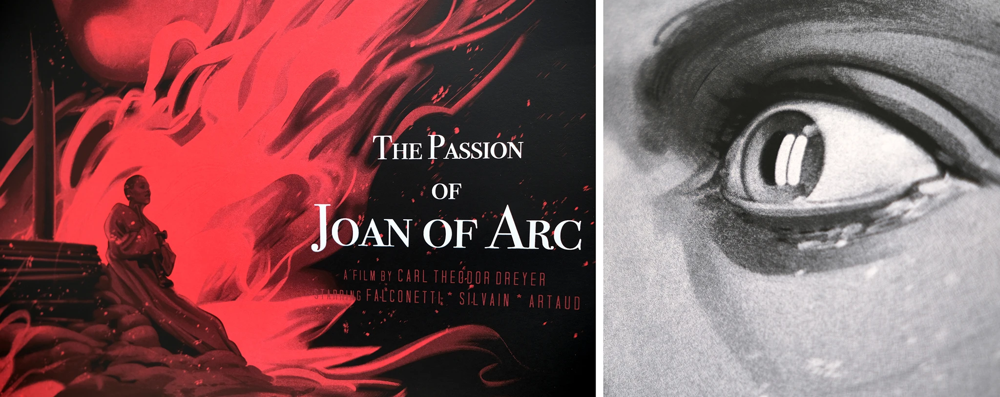
The Passion of Joan of Arc is a hefty film to create a poster for, and Zi Xu certainly rose to that challenge, painting a multi-dimensional portrait of the young Jeanne that is at once torpid and downtrodden, yet edifying and electrified with conviction. The mono palette works brilliantly, but the wonderful touch is the addition of a saturated scarlet—in the simple title of the UK variant, it hints at the judicial prejudice with which the ecclesiastical jury attacks Jeanne for her beliefs; and in the US variant, the entire print is awash with red, soaked in ire. In 1431, divine indignation and the demand for repentance would customarily have a most wrathful and violent conclusion.
(The Passion of Joan Of Arc is available in limited numbers from Black Dragon Press in the UK. SOLD OUT with Mondo in the US
As this was both our and the gallery’s first time working with Zi Xu, naturally we had never before printed anything for the artist, and it was a highly enjoyable task to disassemble Zi’s painting for screen print. We were able to lend to this process a separation technique that we developed over a number of years, and over the course of some remarkable editions.
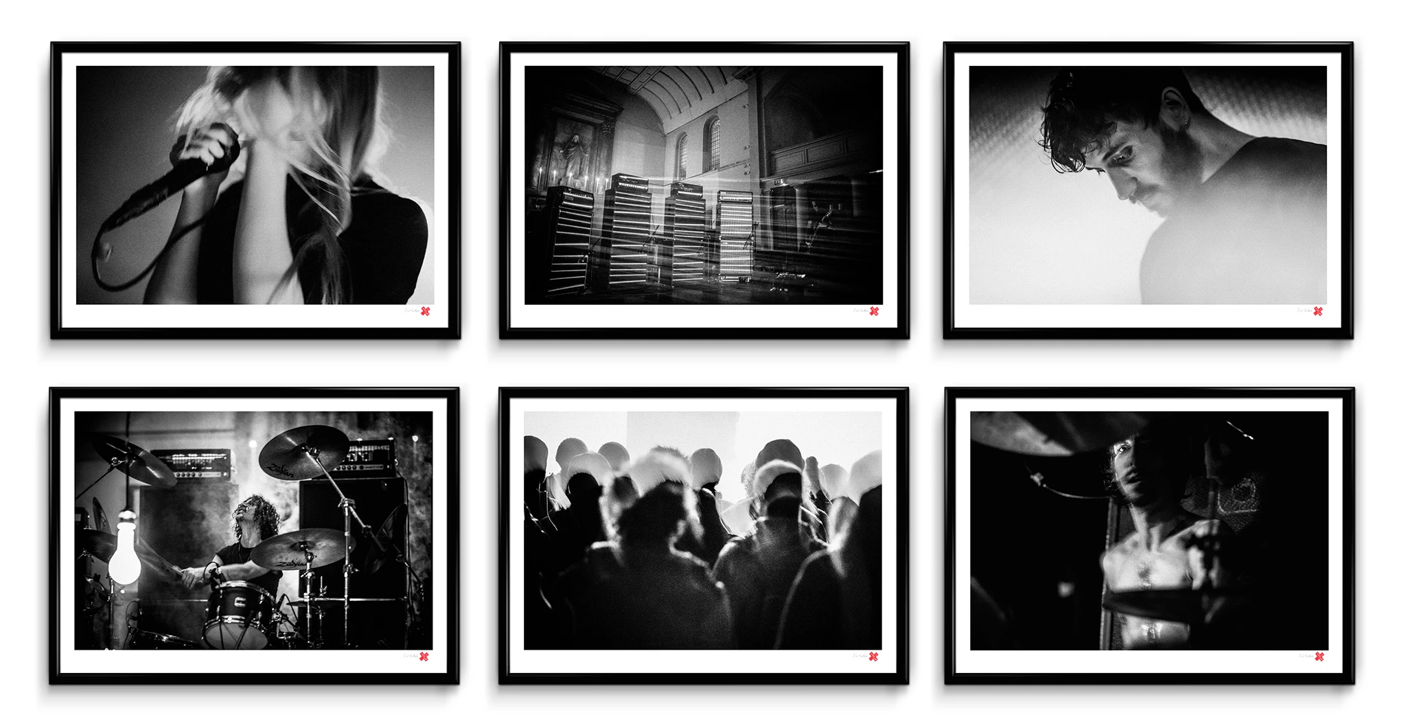
We first developed the separation when attempting to work out a method for screen printing Rebecca’s photography. We swang many a miss on the way to cracking it, but on the road to Rebecca’s 2016 exhibition, YOU’RE NOT HUMAN X REBECCA CLEAL (excerpts pictured above), we eventually devised a handsome way of stripping the artwork down to nothing, before rebuilding it in eight layers of screen print, using all translucent black inks. The results were very strong, and without any delay (as is invariably the case, when a new experimental development is made in the studio) we were able to apply this technique to a slew of personal and client projects.
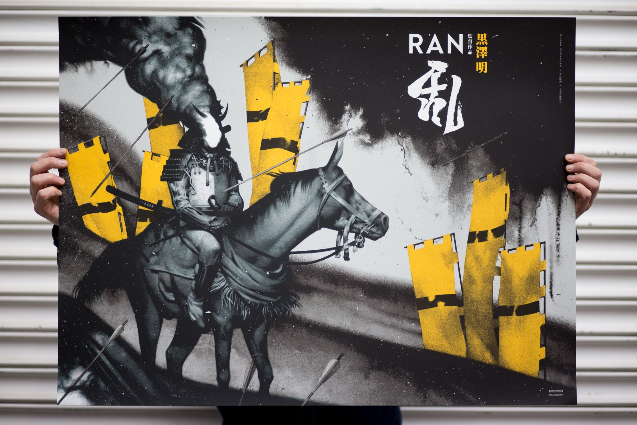
Interestingly, it is Black Dragon Press who have seen the most editions utilise this screen print method. Come and See and RAN (below), both by João Ruas, lent themselves brilliantly to the treatment (as will the artist’s Seventh Seal, which at time of writing is in production).
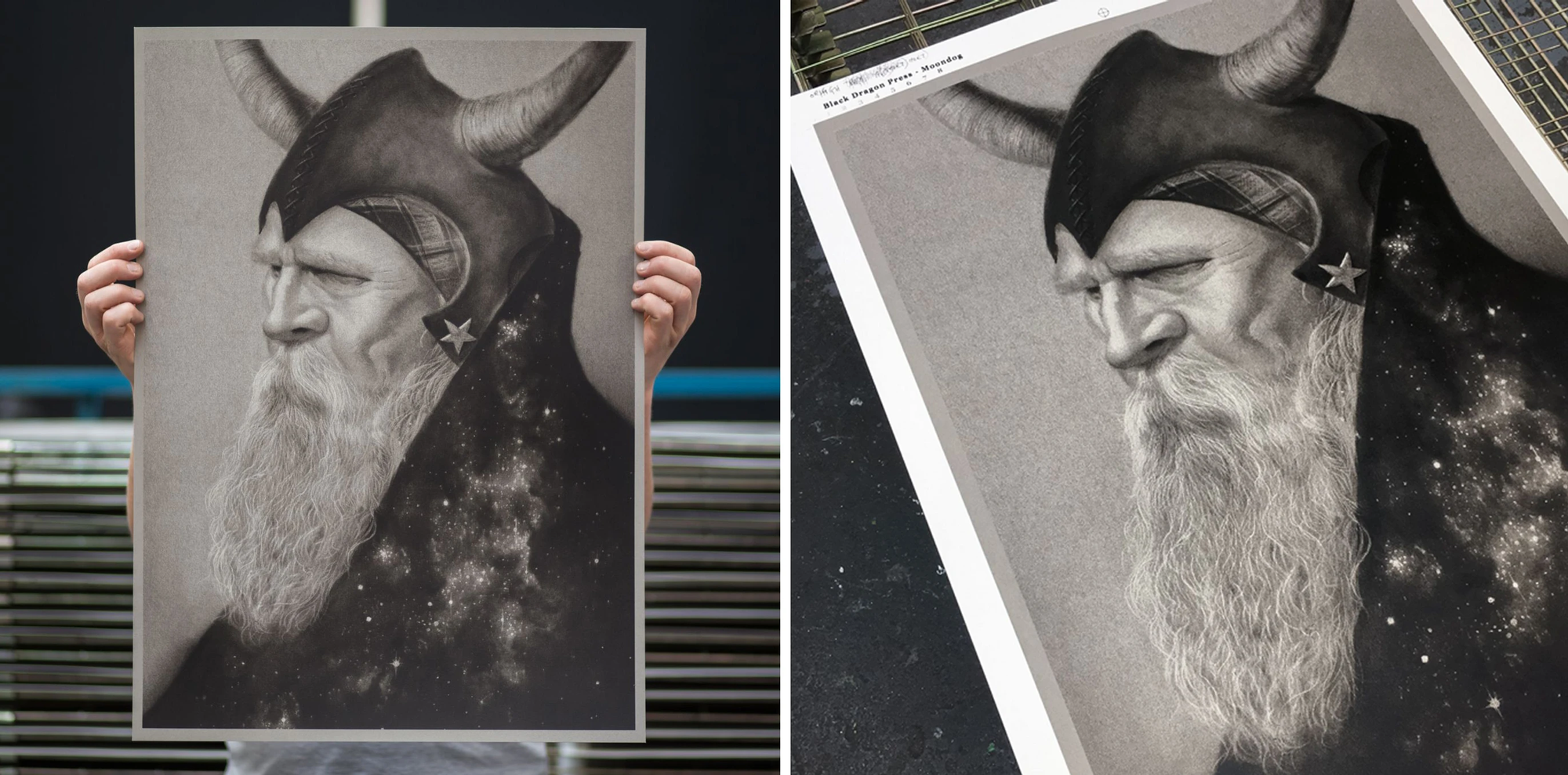
The Ruas editions were closely followed by an excellent portrait piece by Randy Ortiz, depicting the instantly recognisable Viking of 6th Avenue, Moondog. Our understanding is that this piece was commissioned out of a simple love for jazz, on the part of James, the Black Dragon Press proprietor. In any case, the superb pencil drawing by Ortiz translated wonderfully to screen print (below).
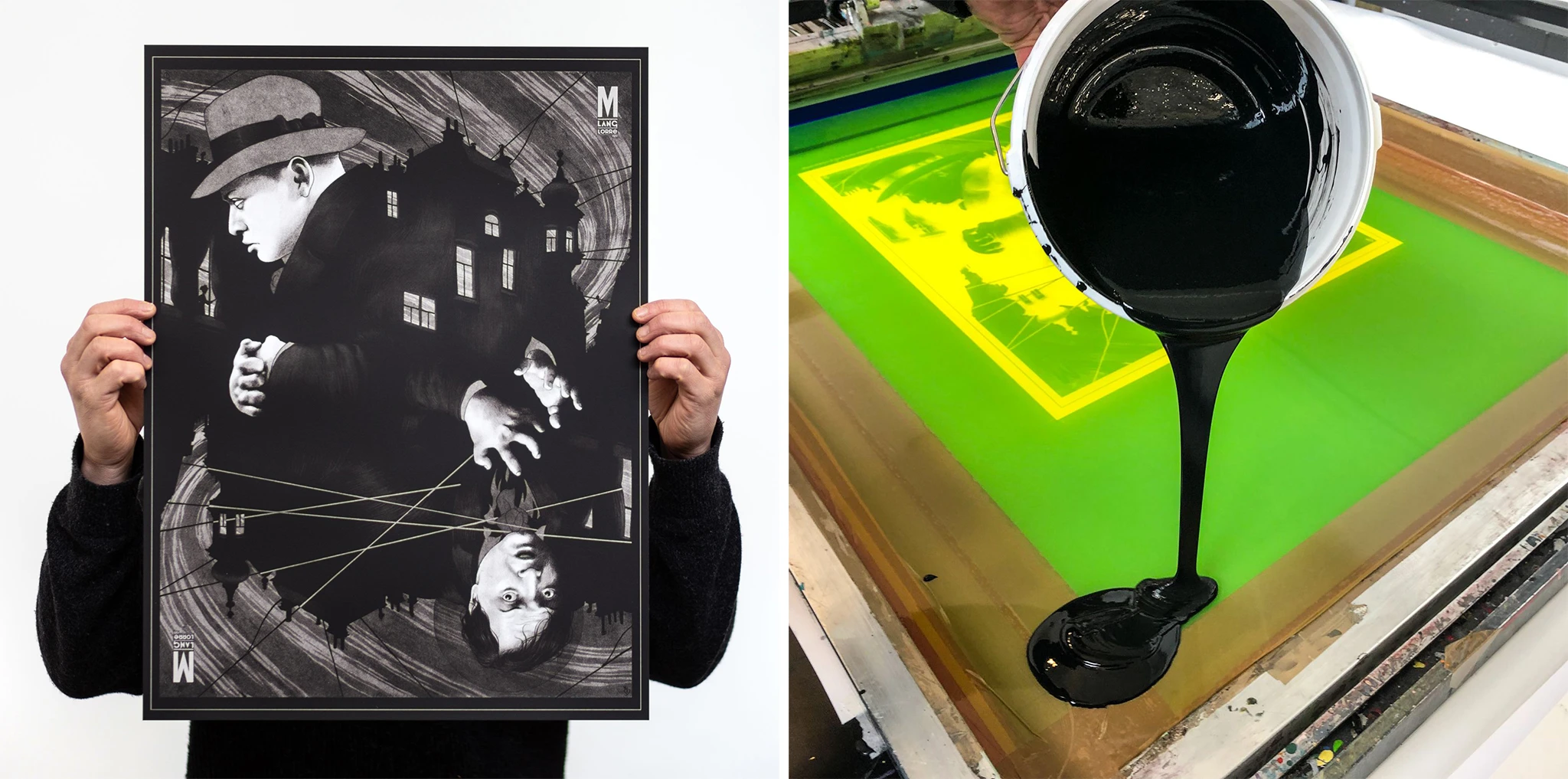
M was a commission for Peter Diamond, one of our favourite artists working in the field. Although the final pitch in this piece is altogether darker than Moondog, it contains similar tonal values, and as such was a great screen print translation. M (below) was screen printed in cool-grey and sepia variants, which required tinting batches of clear-base ahead of creating the range of black shades for print production.
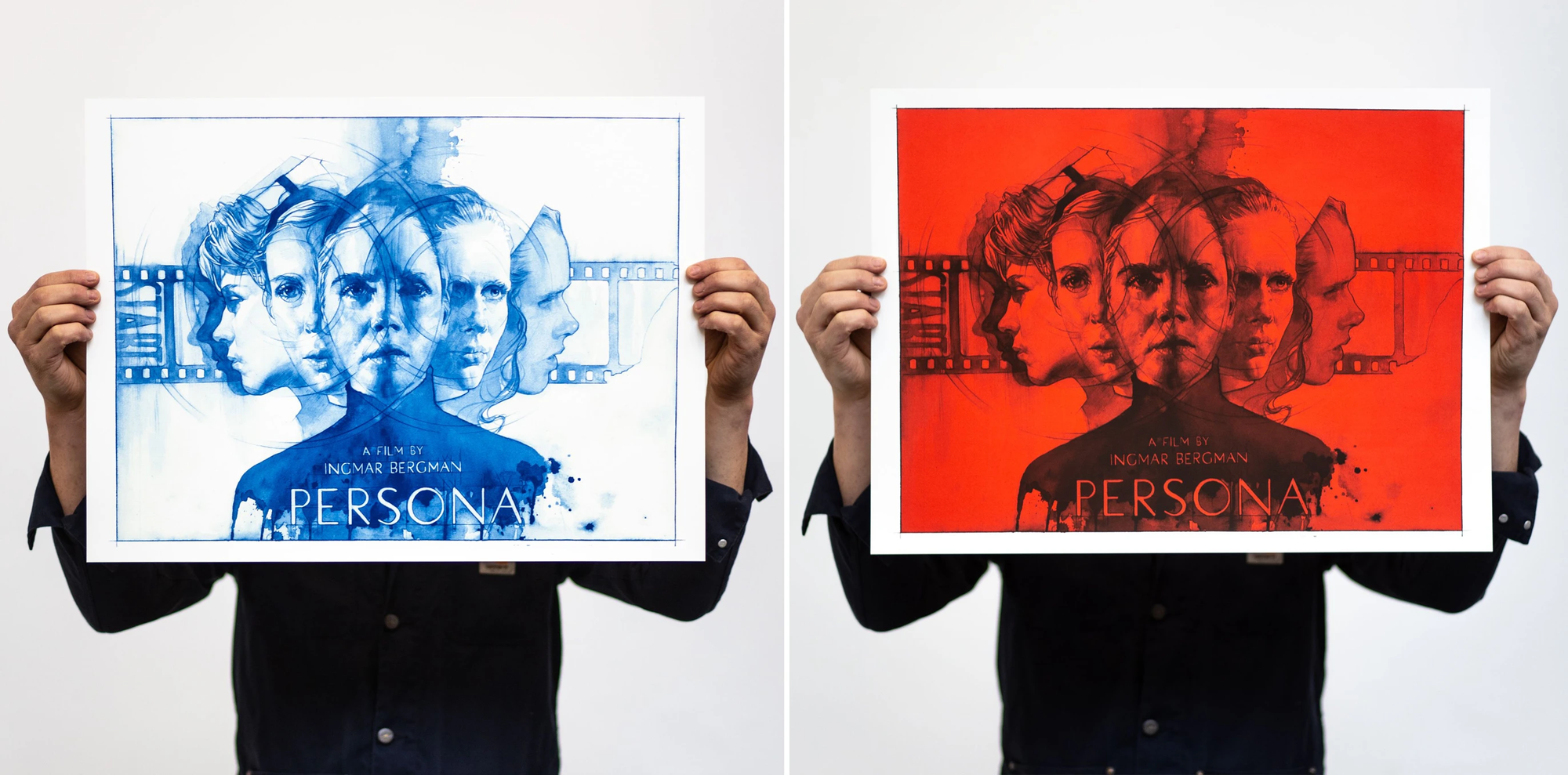
Persona was another Black Dragon Press commission, and, in many ways, led most directly to the printing of Joan of Arc. The mesmerising illustration was created by James Martin, and this release had a red-wash variant, not dissimilar to the US variant for Joan of Arc. Persona (below) provided an interesting challenge when separating from the original flat art, and was the first time we layered a print using a single colour, other than black. In this case, blue.
More recently, we got to work on a fantastic project with Dark City Gallery and Jonathan Burton, which celebrated the 50th anniversary of Ken Loach’s classic British film, Kes. Jonathan captured the conflicted expression of Billy with a real tenderness and lightness of touch. The moment depicted is when Billy takes the falconry book, gifting himself something when he already has so little. From the point of view of the screen print, it was hugely rewarding to create such a faithful translation. As part of the project, Dark City Gallery produced a wonderful film, which puts a spotlight on the creation of the poster and the history of Loach's film. We’ve posted it below, for your pleasure.
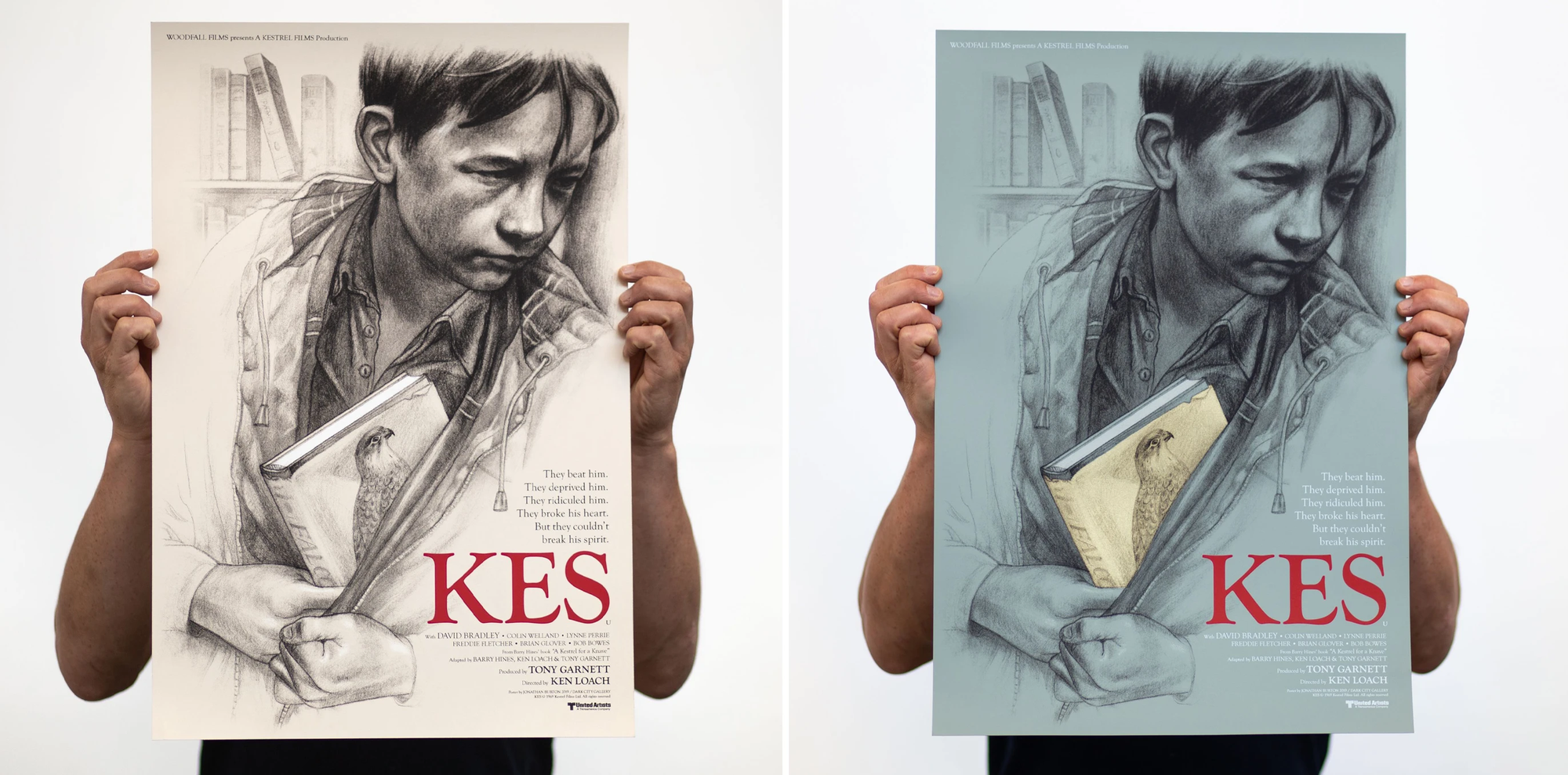
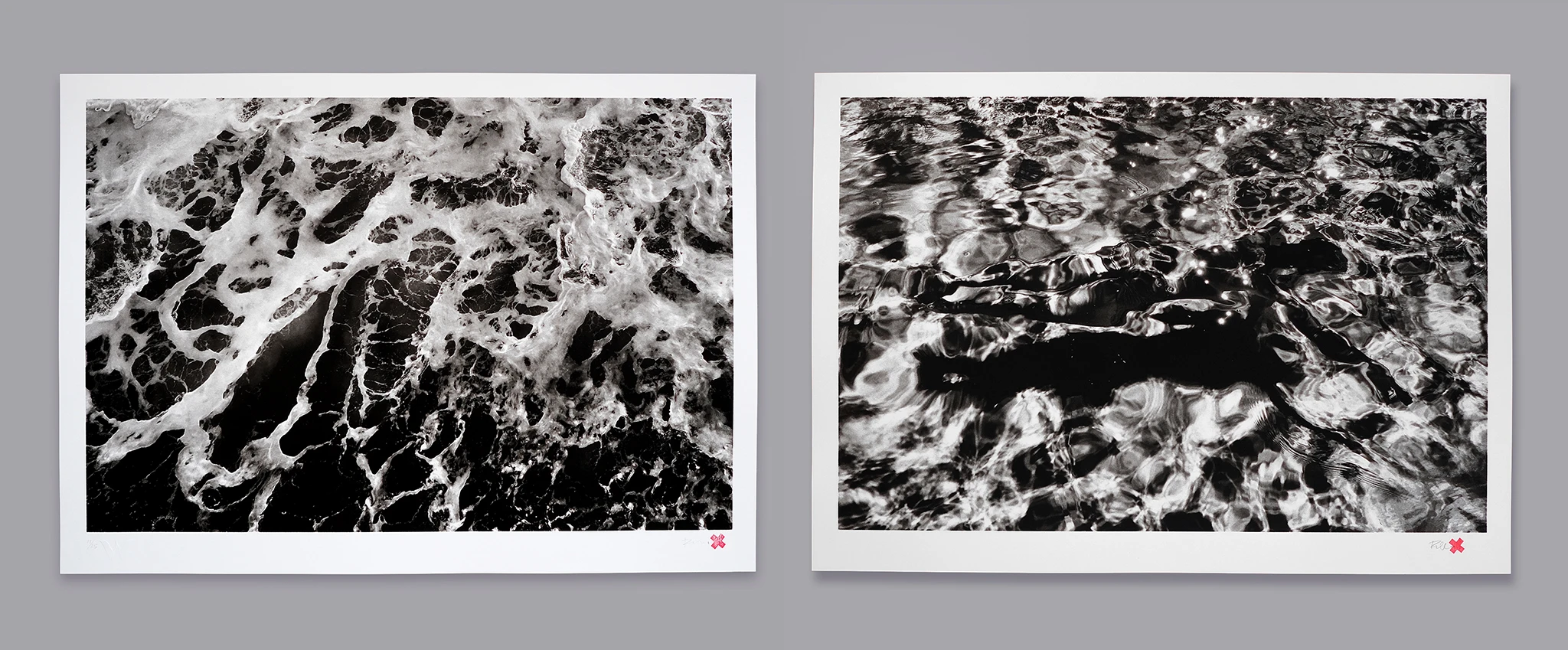
Alongside client work, we of course continued producing editions of Rebecca’s photography, here at the White Duck Editions studio. The prints that were produced for YOU’RE NOT HUMAN X REBECCA CLEAL led, perhaps most notably, to the creation of Rebecca’s Water Series, with two releases to date: English Channel and The Diver (below).
This is by no means a definitive list, and these won’t be the only editions we work on in this manner. More will come down the line. And, of course, this is only one way to make a screen print from a piece of artwork. Every studio has its own way of doing things, and the screen print medium is so extraordinarily versatile, that increasingly we’re seeing artists and print makers coming at the challenge of making a print from angles hitherto unfathomable.
The future aside, Zi Xu’s Joan of Arc certainly provided a great opportunity to look back over a half decade of screen print at White Duck, which was a thoroughly enjoyable way to spend a few hours on a Sunday.
We hope you got a similar kick out of looking over this blog post.


