
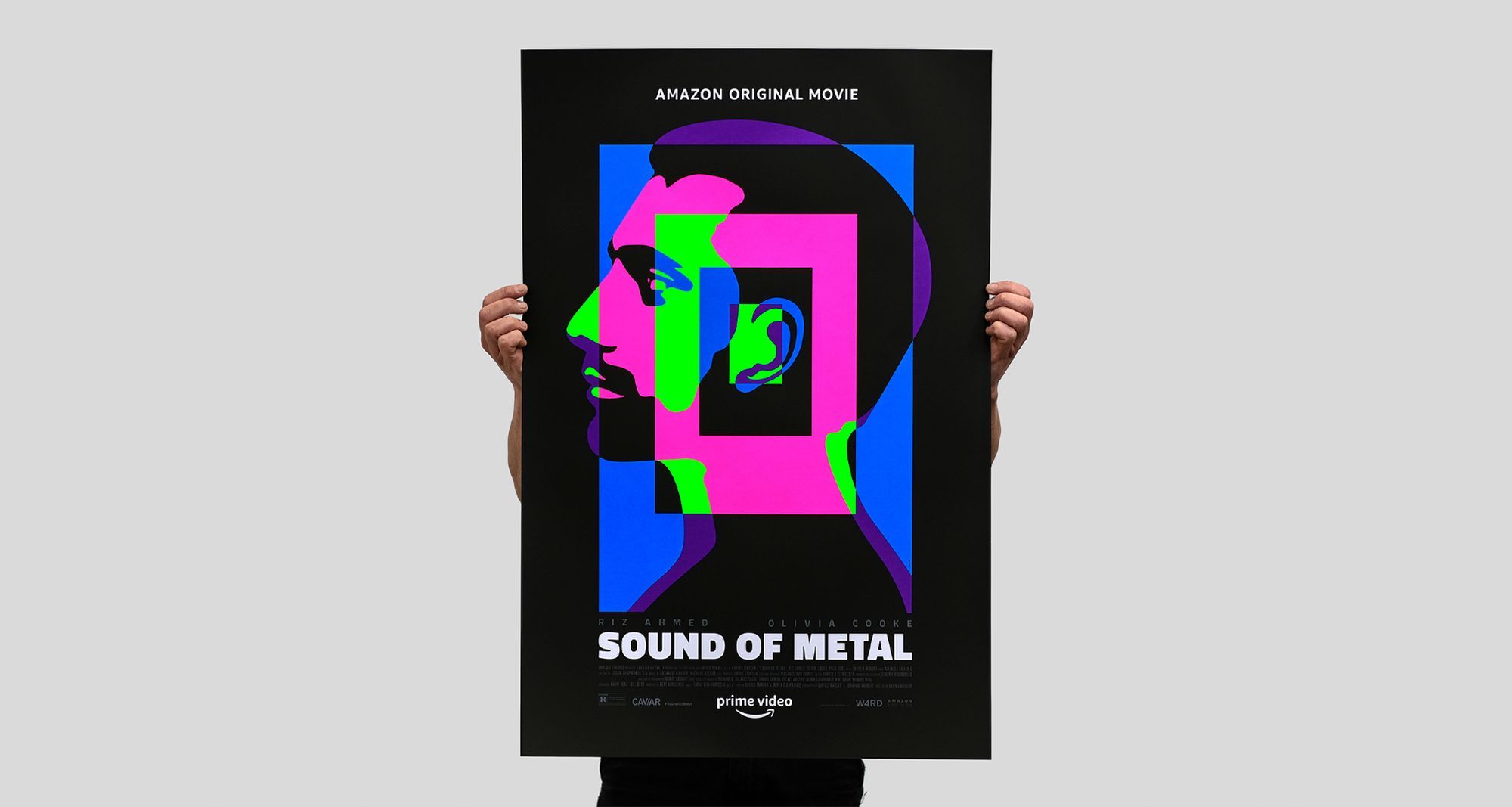
Sound of Metal by La Boca.
Scintillating concept and sublime execution are the order of the day for La Boca’s official Sound of Metal poster.
Sound of Metal is a new screenprint edition by La Boca.
This project is the next in La Boca’s ongoing collaboration with Amazon Studios, and comes at a timely moment, with the Darius Marder film gathering multiple Oscar nominations at the 93rd Academy Awards, going on to win in the categories for Best Film Editing and (aptly) Best Sound.
There will be plenty of news written about the ascendency of Riz Ahmed, arriving as he has at an Oscar nomination for Best Actor in a Leading Role. He is of course the main focus of the film, and one could say the main focus of the poster, too. Though arguably it is the sound part of Sound of Metal that assumes the centre stage position.
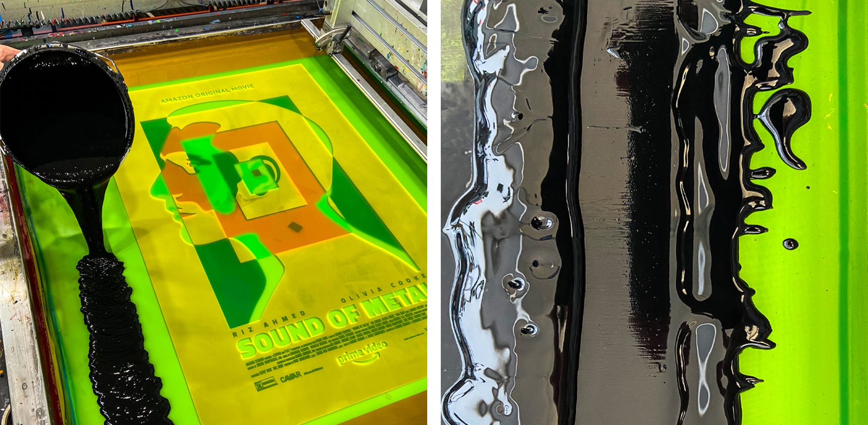
In the film, Riz Ahmed’s character is called Ruben, and in the poster, it is Ruben’s ear that draws the eye to centre. The ear forms the focus of a variegated single point perspective, walled by clamorous-colour and abyss-black, as if what Ruben hears is caught in the light-speed tunnel from Kubrick’s 2001: A Space Odyssey, where one’s relied-upon reality is dilated and pinched, broken apart and reassembled in a different order.
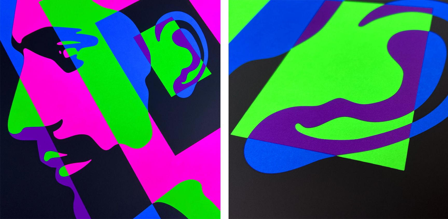
La Boca’s use of fluorescent colours against silhouette black — the way those colours merge and intersect, morphing into one another, locked in a transmutation of form — feels like an incredible way to convey the steady disintegration of something vital. Fragmentary and incandescent are the fleeting present and the memories of life before, while the creeping black-out poses a foreshadowing of isolation within oneself — the onset of a personal void. Perhaps the things we take for granted burn most brightly during the moments before they are extinguished?
Yet amidst a personal chaos, where the shape of known things become distorted, out of this darkness new forms emerge and existence reshapes itself. The things we take for granted often relate to how we interact with the environment around us, the relationship we have with people and place, and how our senses are essential to our sense of identity; and when this level of existence is upended, tilted beyond our control and bent into an unrecognisable shape, we are are forced to build new survival systems, find new people in whom to trust, and forge a way to renewed forward momentum.
After the fact, perhaps we see that our perception of forward momentum was actually a stasis, and we needed a jolt to the system to shock us into new patterns of thinking and seeing. Sometimes the end of your world is the start of your life. In this respect, there is something wholly beautiful about La Boca’s poster, as if it depicts the experience of sound by a synesthete or from a radical other angle. As well as sound, everything has a colour and a shape, and a superposition that can be approached from any side. There is always more than one way to take a grip of that which is in front of you.
It may appear rich, to point at La Boca’s poster for Sound of Metal and say that it is all of this, but overwhelmingly the feeling is that the shape of experience and the colour of perception are what reside at the heart of it. The shape of the past; the amorphous transitory form of there to here; the layered colour of a future, never-before-envisaged.
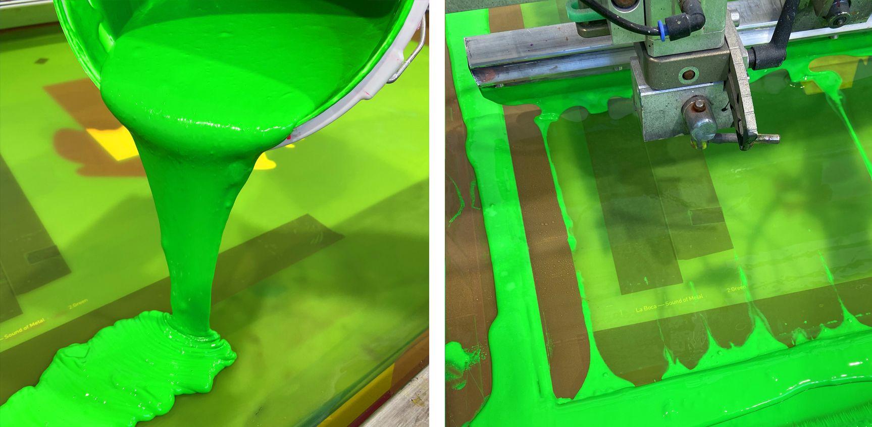
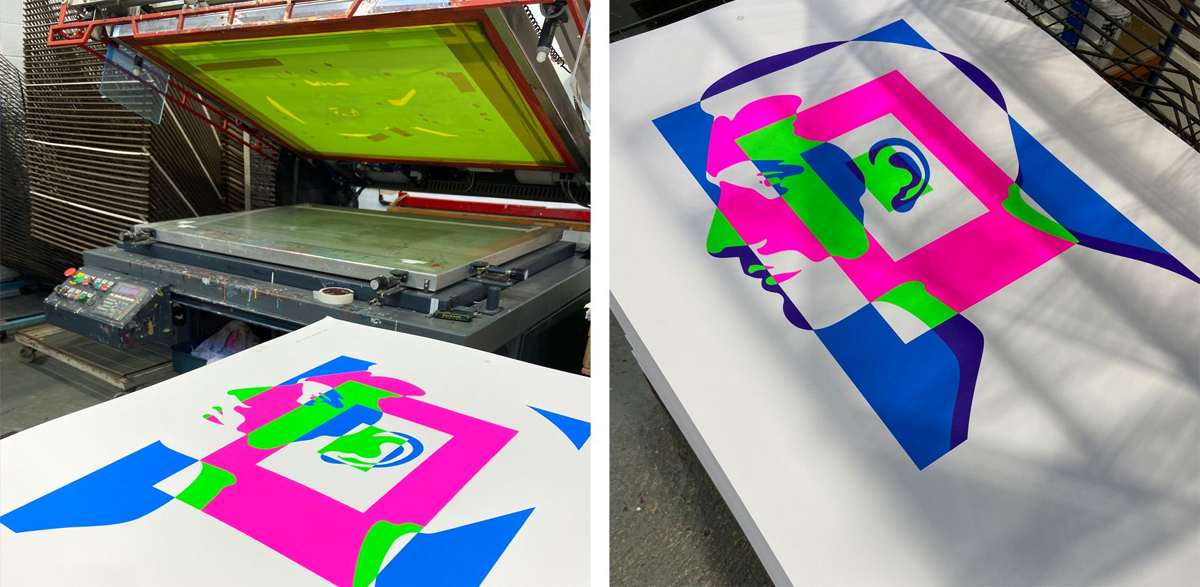
La Boca’s work of late has been a vivid feast for the eyes, with fluorescents making regular appearance. We were only recently treated to the design studio’s exceptional work for Folio Society’s The Complete Short Stories of Philip K Dick — a compendium box-set of beautiful books, resplendent in fluorescents. Working with fluorescent inks in screenprint presents its own challenges, chiefly because the inks by their nature are highly translucent. This gives rise to the prospect of visible trap lines: a darkening at the intersection of two inks, where they overlap, just ever so slightly, and interact in a tangible way. The trick is to separate the artwork with minimal overlap (in this case, around 1/6mm) so that the interaction of colour is held at bay, but also so that the screenprinted desirability of it remains. In a 24”x36” print, it’s a fine line to walk.
For us, working with La Boca is always a joy and a privilege, as it’s always impossible to discern where commercial design ends and art begins; and in that thin line between, great discourse and next-level making never fail to exist.
The Sound of Metal is available exclusively from La Boca. Head over to their Print Shop for full details.
The edition was screenprinted at the White Duck Editions studio in a 24”x36” edition of 75 + studio copies and AP’s, in 6 colours on 300gsm Gmund Bauhaus paper.
