
Fantasy screenprint editions by Marylou Faure.
On a first outing with French illustrator Marylou Faure, we had the great pleasure of screenprinting a series of new art editions, each one full of the artist’s signature use of colour, strength of line, and unmistakeable character.
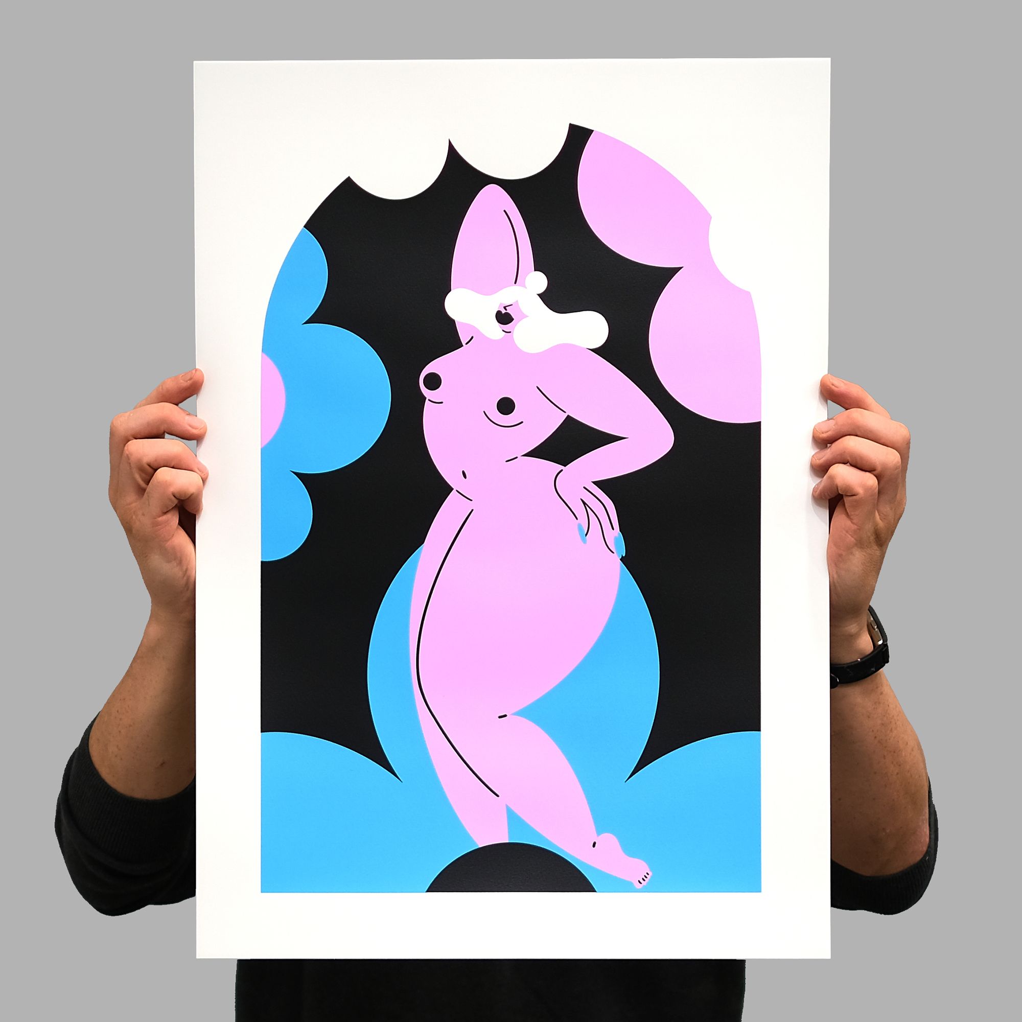
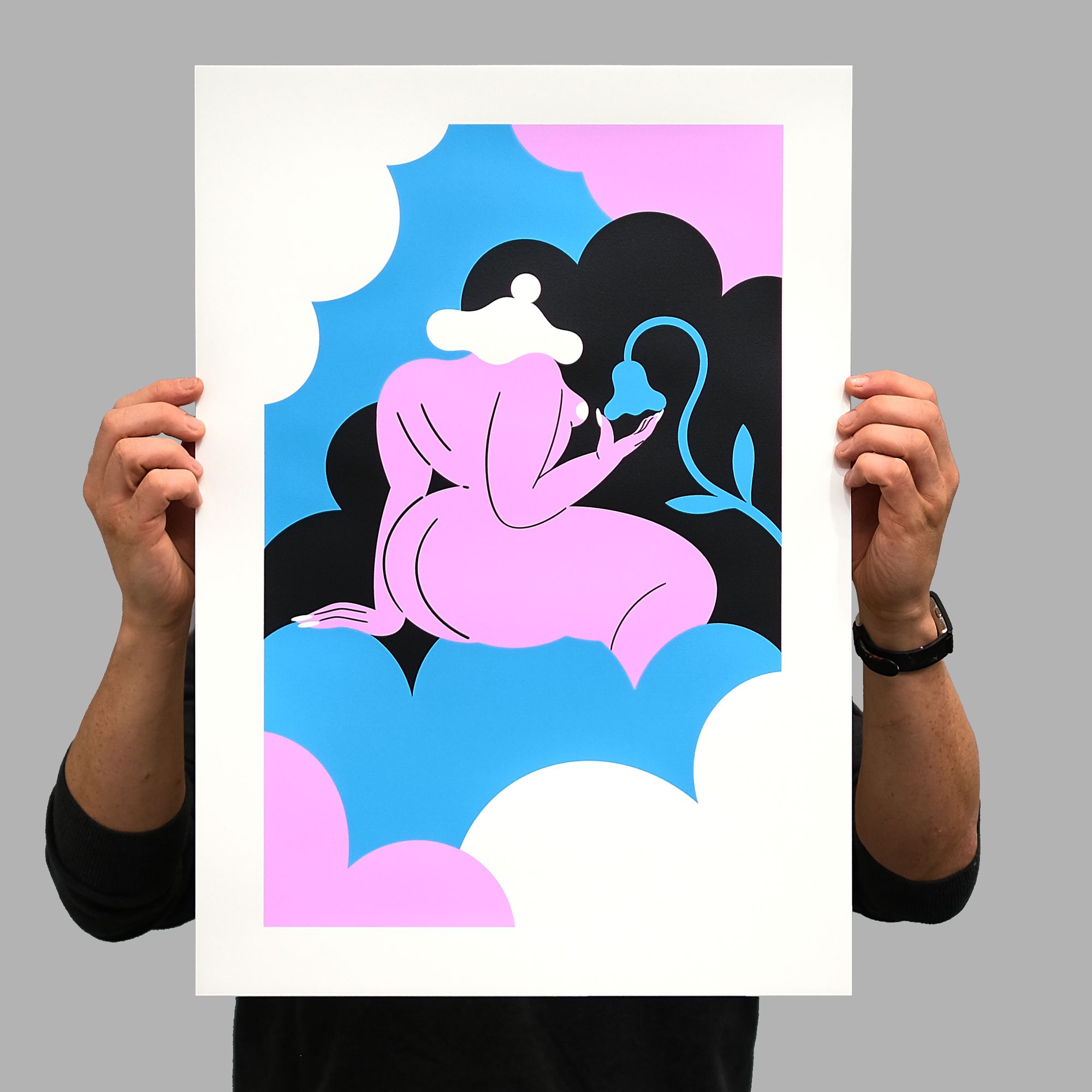
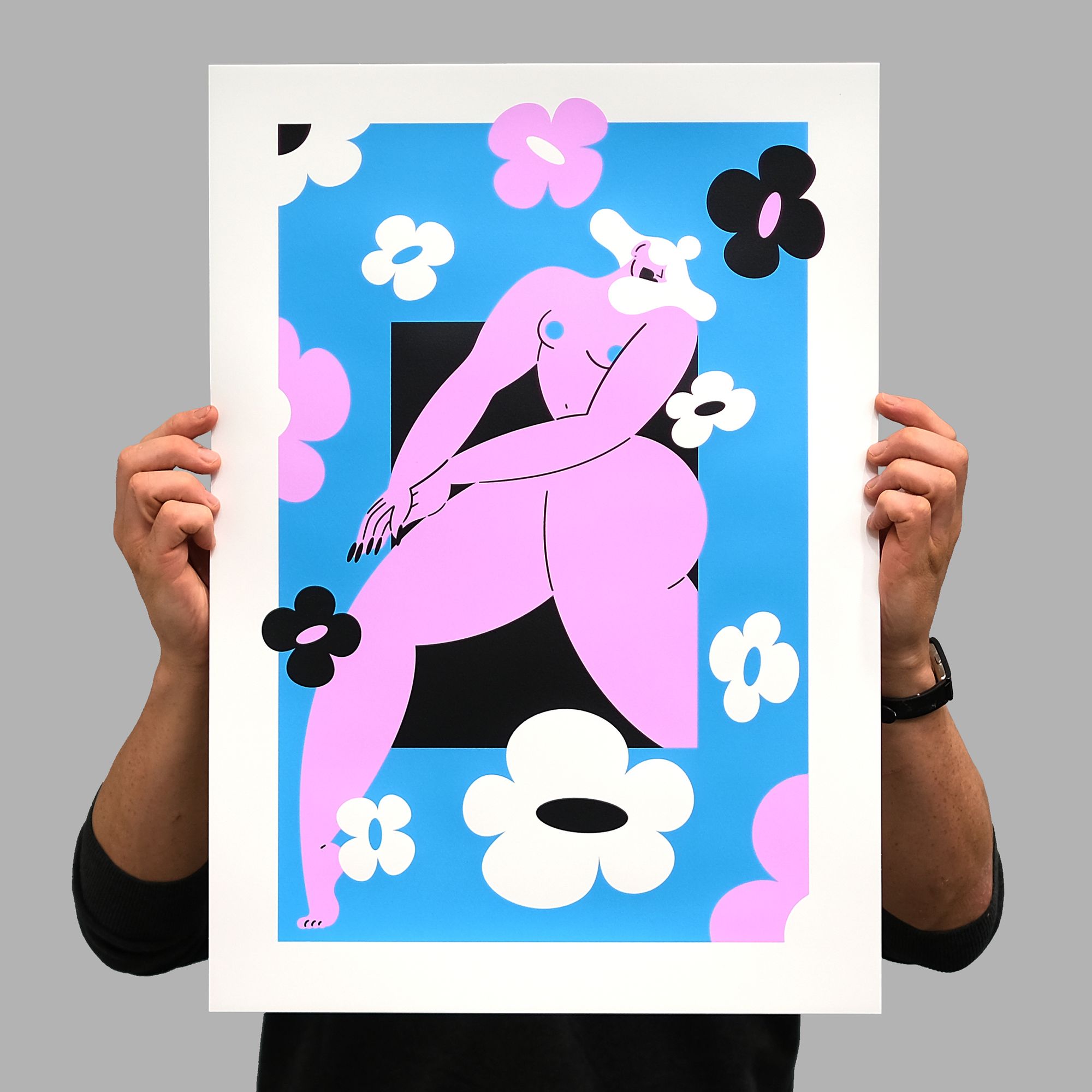
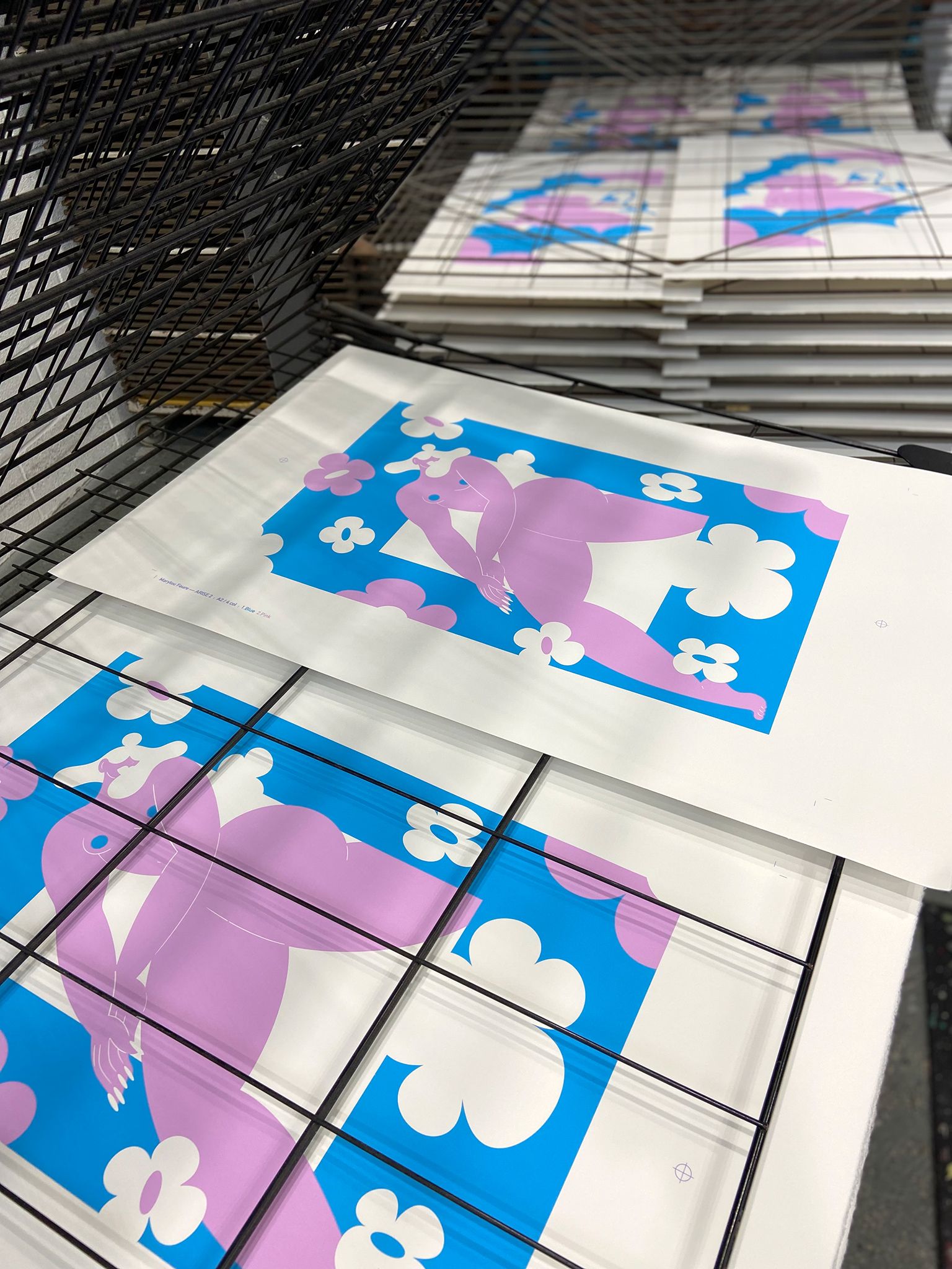
Fantasy I, II, and III are a new series of screenprint editions by Marylou Faure, the French illustrator known for the strength of her character design and her striking compositional touch.
We’re big fans of Marylou’s art, since a conversation with Counterprint Books really opened our eyes to the illustrator’s work. This was ahead of the artist’s then-forthcoming monograph, which was released by the publisher in 2020.
We were understandably thrilled to work on a set of prints with Marylou, and so enraptured by the artworks that we wanted to know a little more about their creation.
Produced over the winter and early spring of 2021, Marylou explained that the Fantasy prints had arisen from a larger series of original artworks, saying:
“The originals were painted using Posca pens, and the Fantasy series was really a way to get out of the very real and slightly depressing vibes of 2020, by having an imaginary world my characters (and myself) could escape to.”
This adds great heft to the breath of vivacious fresh air that the artworks provide, knowing what their creation was looking to counter. Interested in the possibility that the print series has a central character — one who seems ever-present in the artist’s work — we asked Marylou if this was in fact the case. She explained:
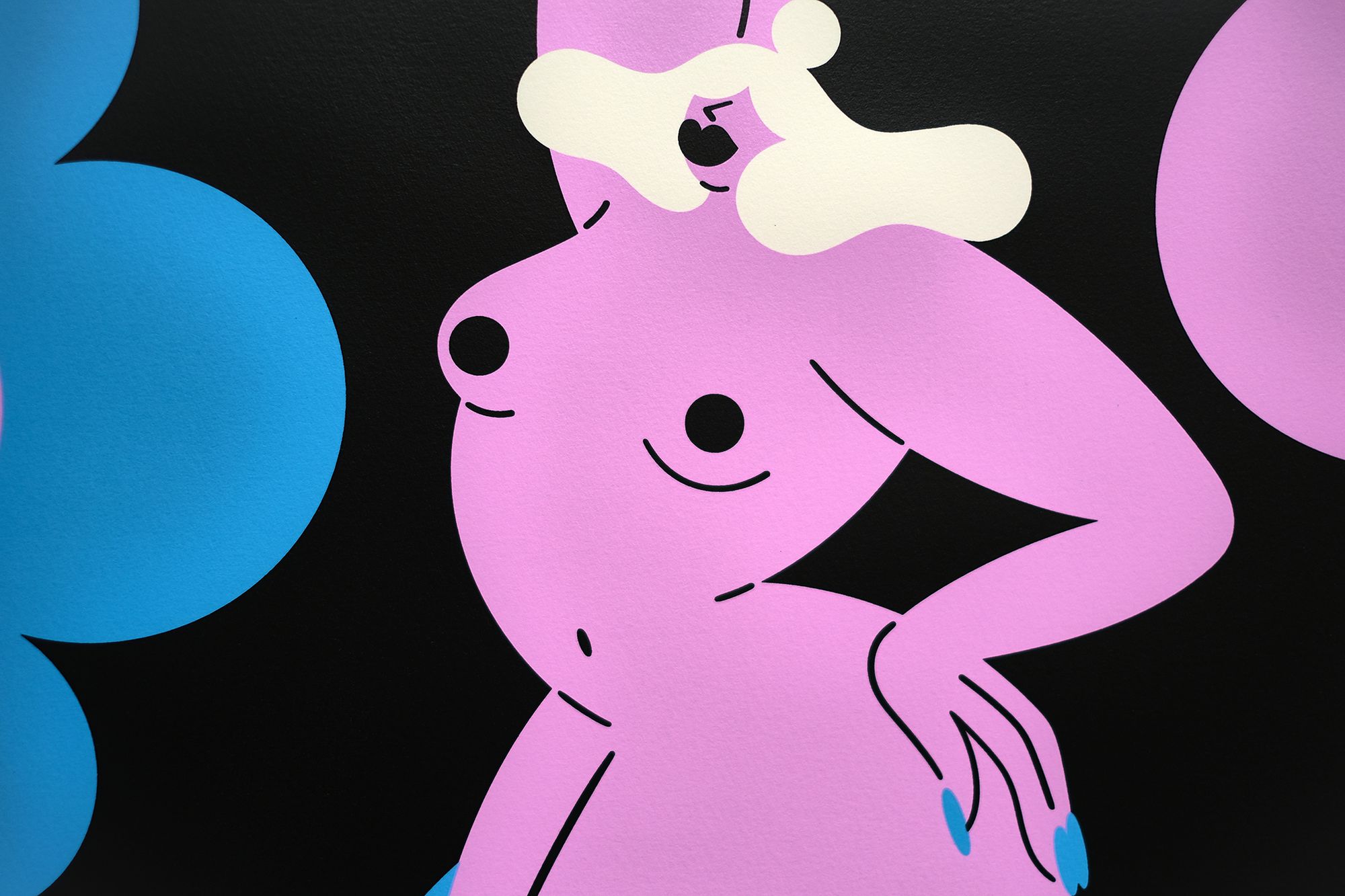
“I guess my characters are all different versions of the same main character. I think the idea is to have them as a representation of someone who’s dreamy, playful and confident.”
When asked if they have a name (singularly or collectively), it transpires that the artist rather affectionately calls them “my babes”. An altogether sweet term of endearment, but also an attribution that suggests solidarity and togetherness. Strength in numbers, as well as a strength in the one self.
The work speaks on so many levels, and with a joyously direct voice.
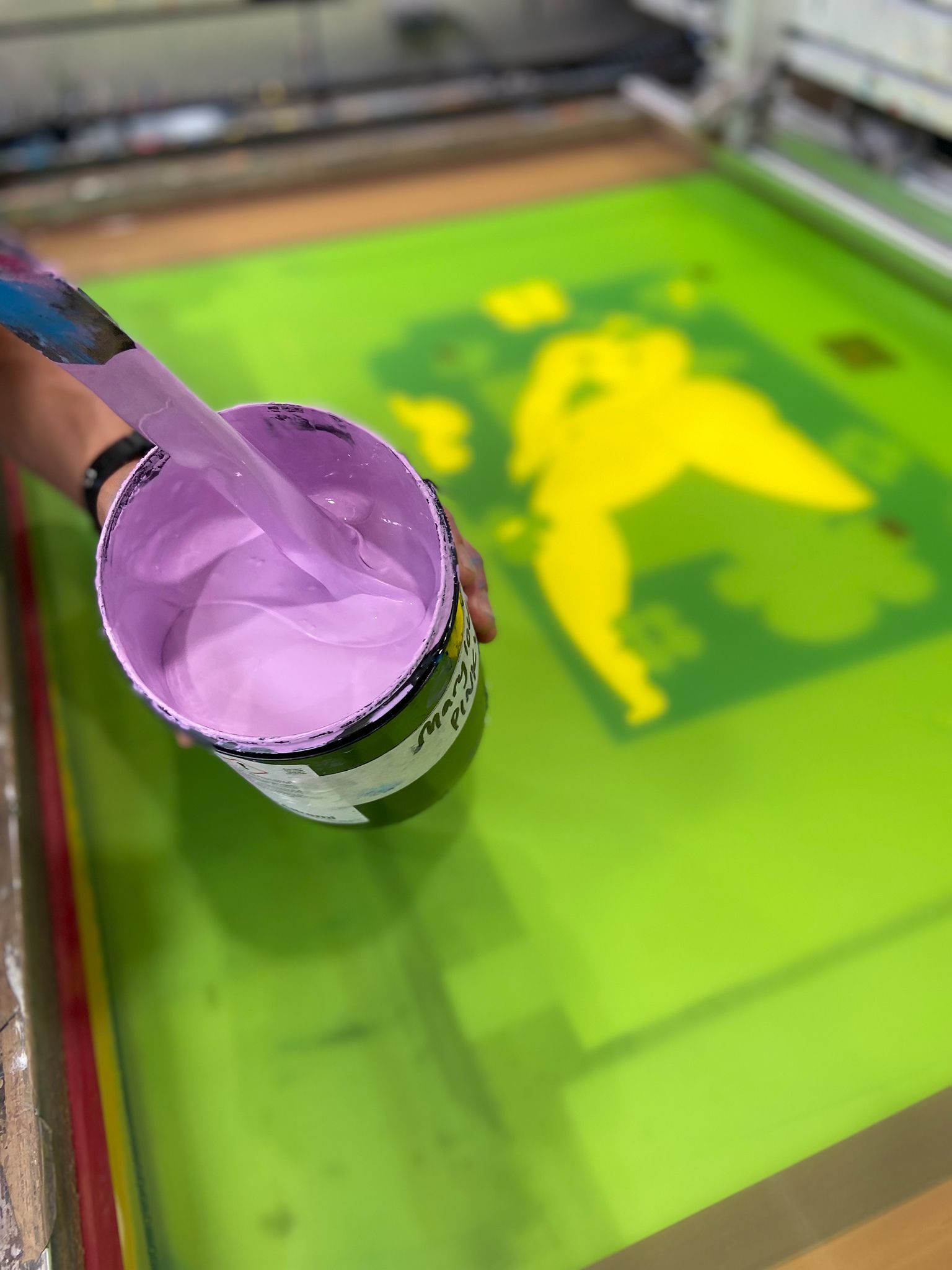
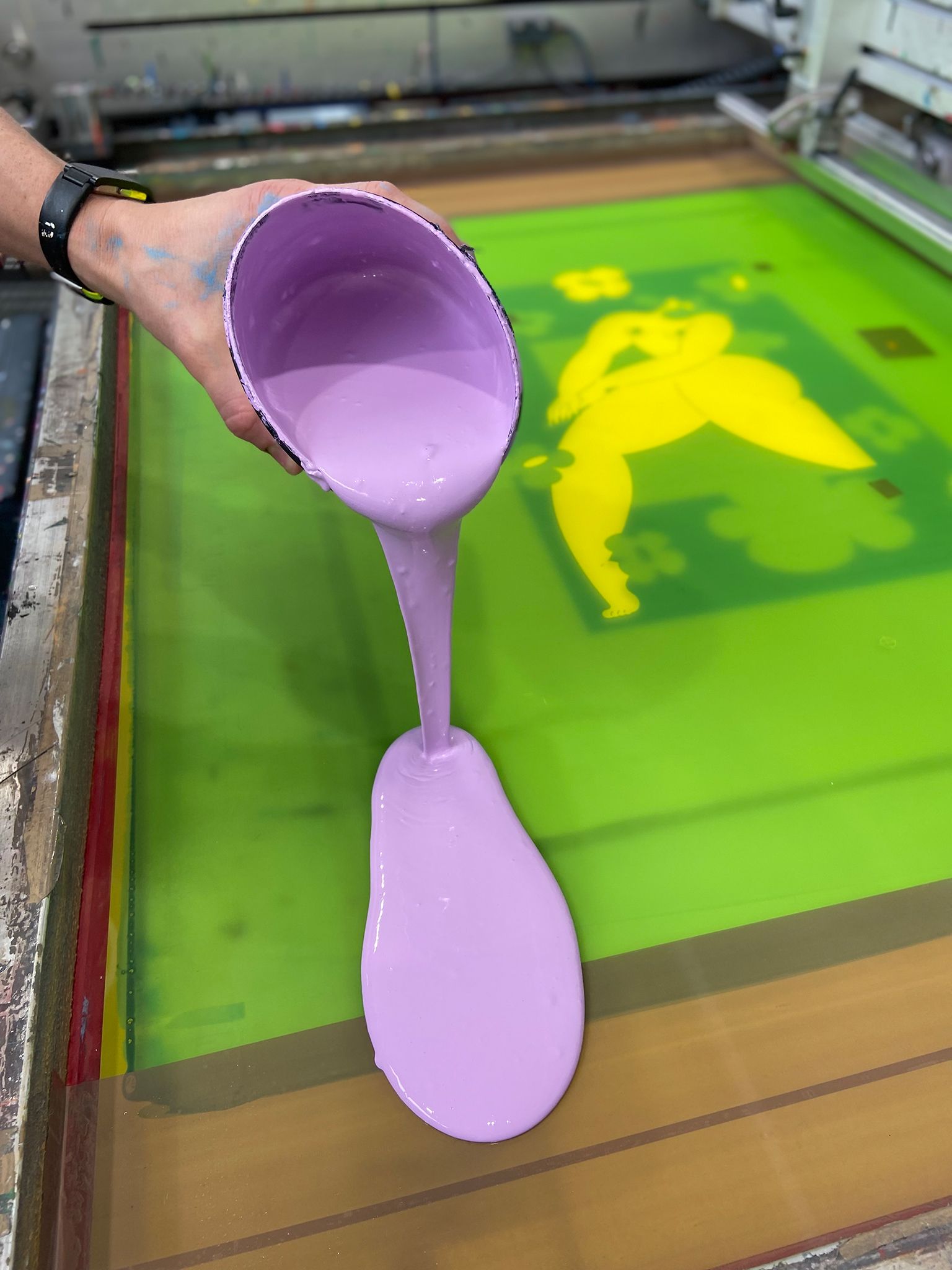
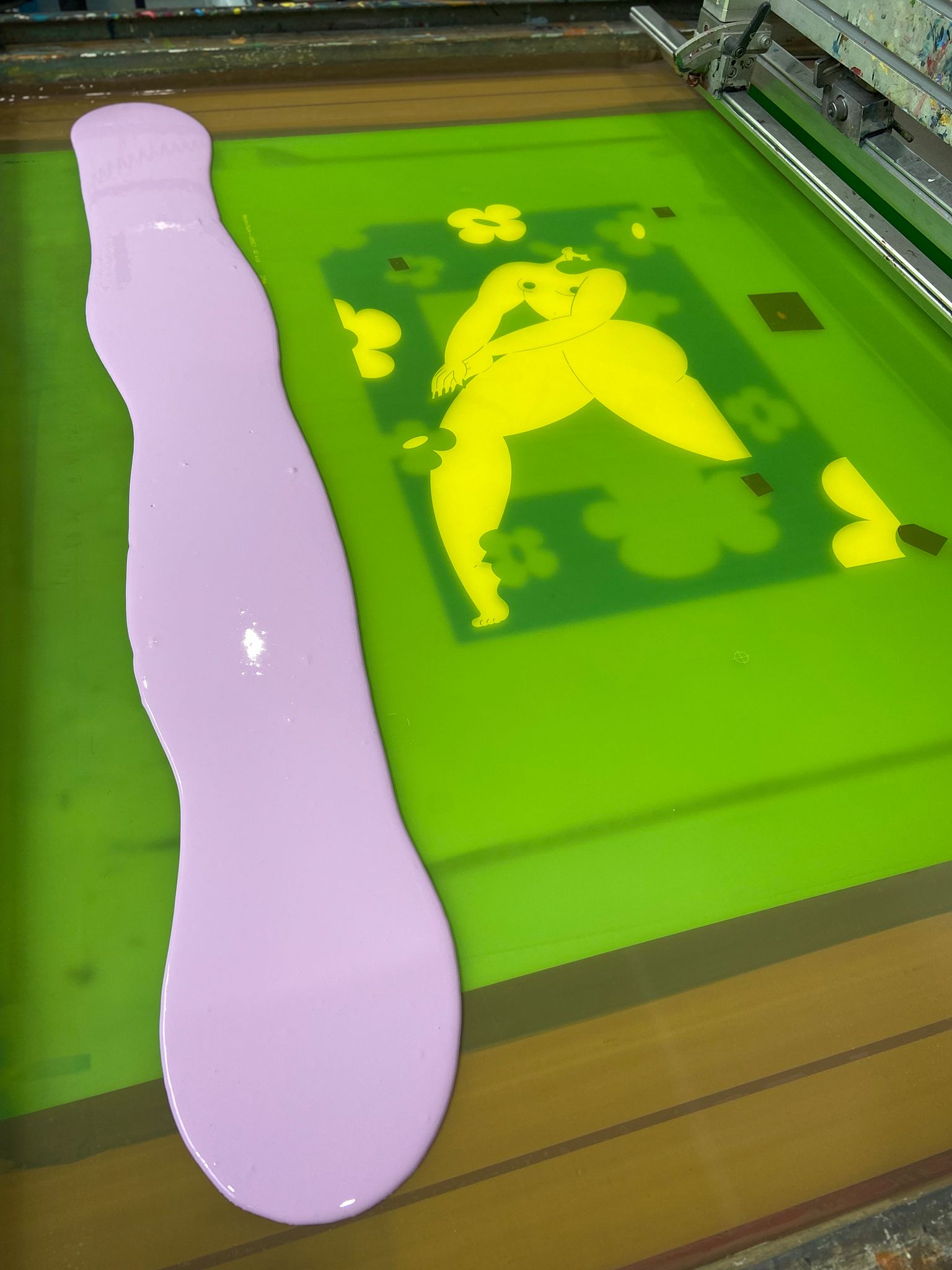
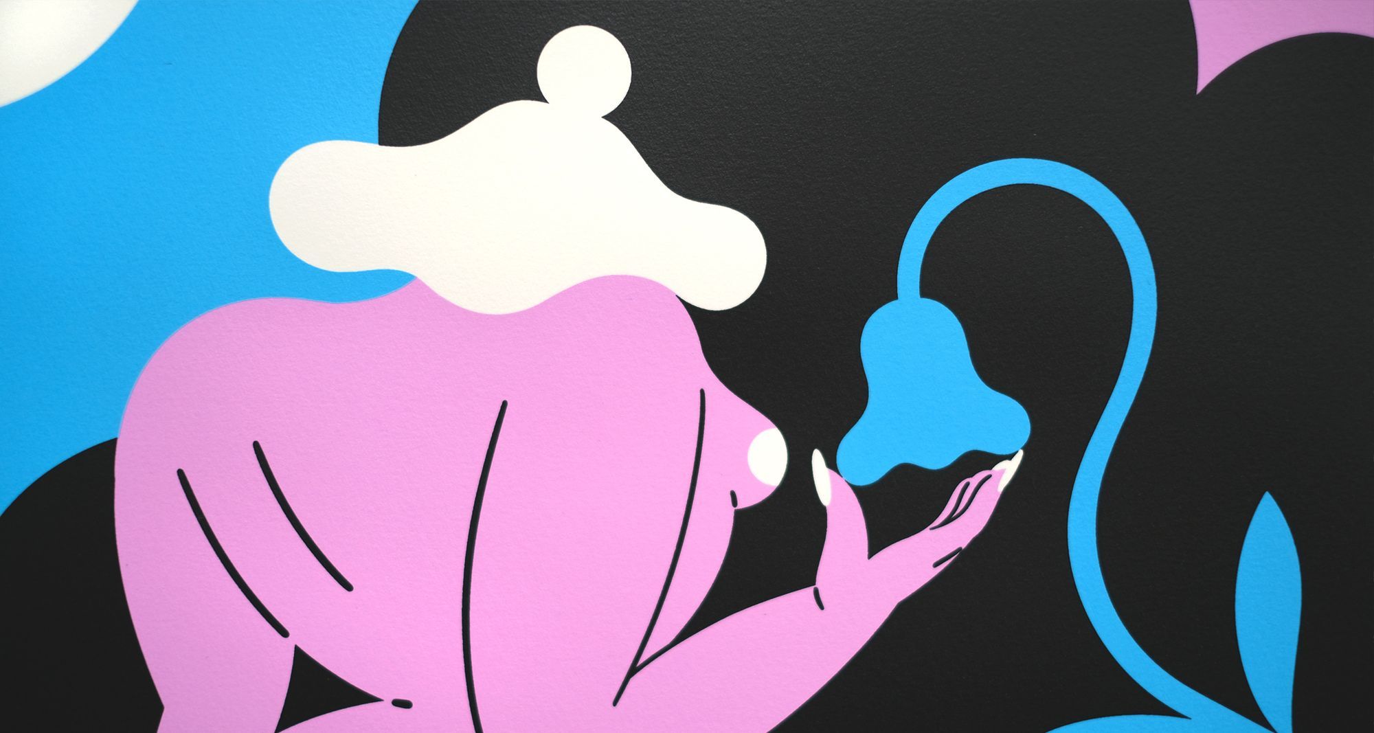
For the Fantasy editions, obviously important were the colours. With a limited palette of pink, blue and black, we spent some preliminary time creating the inks and producing swatches to send to the artist’s studio.
The artworks were then separated from the flat originals, with all of those beautiful lines cleaned and trapped to one another. From a print point of view, the challenge with such artwork is in managing the interaction between bright colours. With Fantasy, that is where the pink and blue come face-to-face. Both colours are naturally translucent, to give them their vibrancy, and so the way in which the two interact will always be visible.
The objective, therefore, is to have enough interaction to allow the nuanced movement of the screenprint medium, but not so much that a distraction is caused by the darkening of overlapping inks. It's one of those necessary facets of screenprint which, when the sweet spot it hit, readily lends its charm to the final prints.
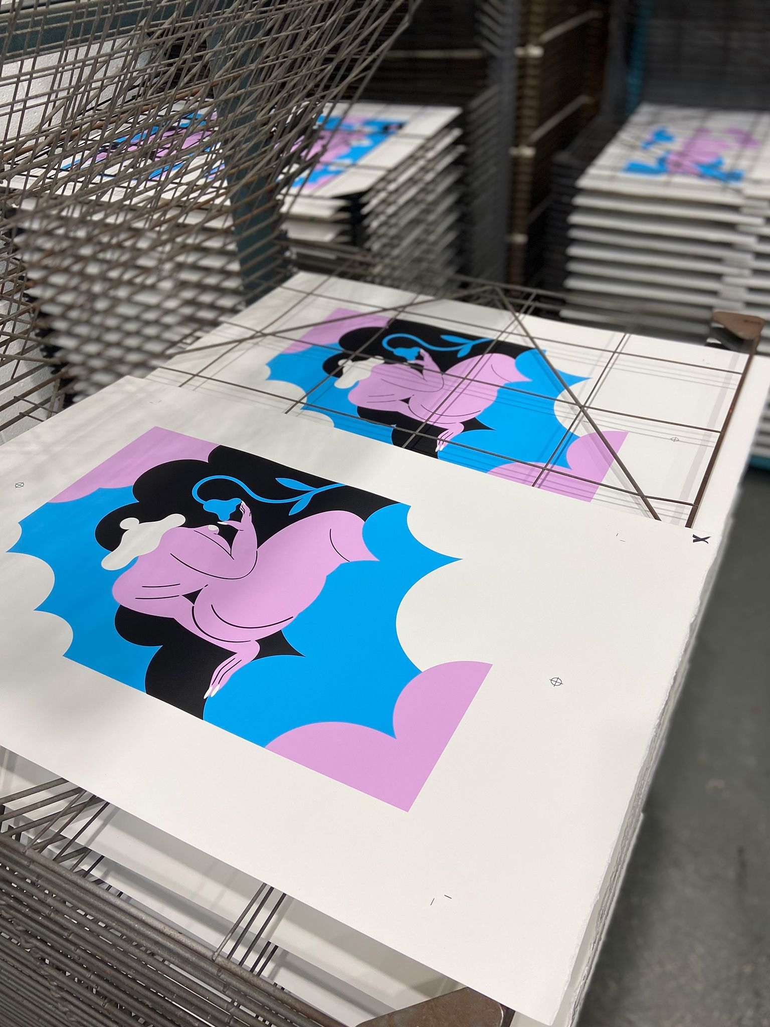
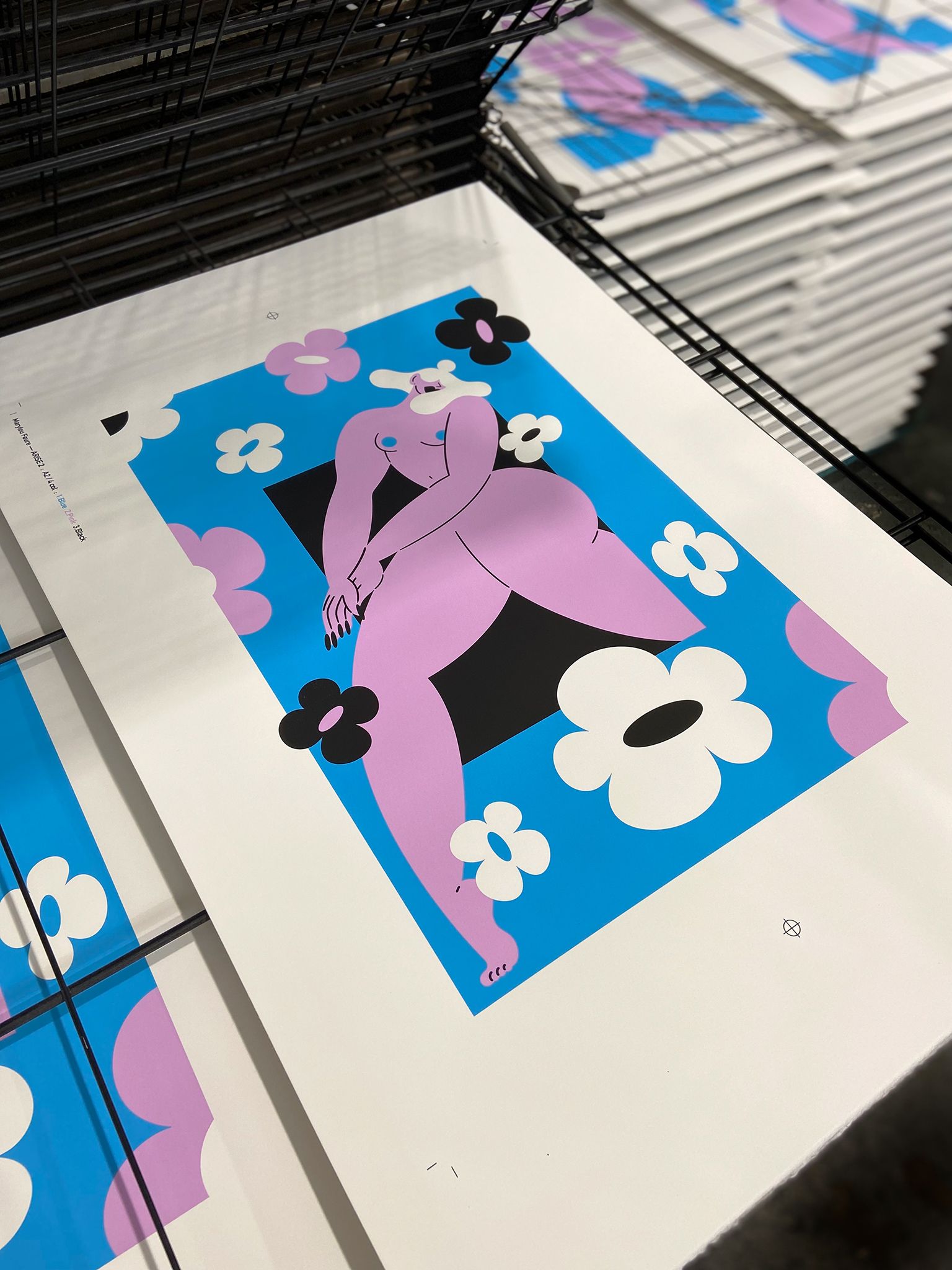
Finally, at Marylou’s behest, we experimented with adding a gloss overprint to the inks, which was subsequently run over the all three editions, giving the prints an enchanting shine and depth.
To find out more about these screenprint editions, visit Marylou Faure’s shop, where all three Fantasy prints are currently available.
The Fantasy series of screenprints were produced at the White Duck Editions studio, in limited editions of just 20, and in 3 colours + gloss overprint onto 310gsm Somerset Tub-sized Satin paper.